
ProDiMa: A Task Management Flow for On-the-Go Product Teams
VMO Take-Home Challenge
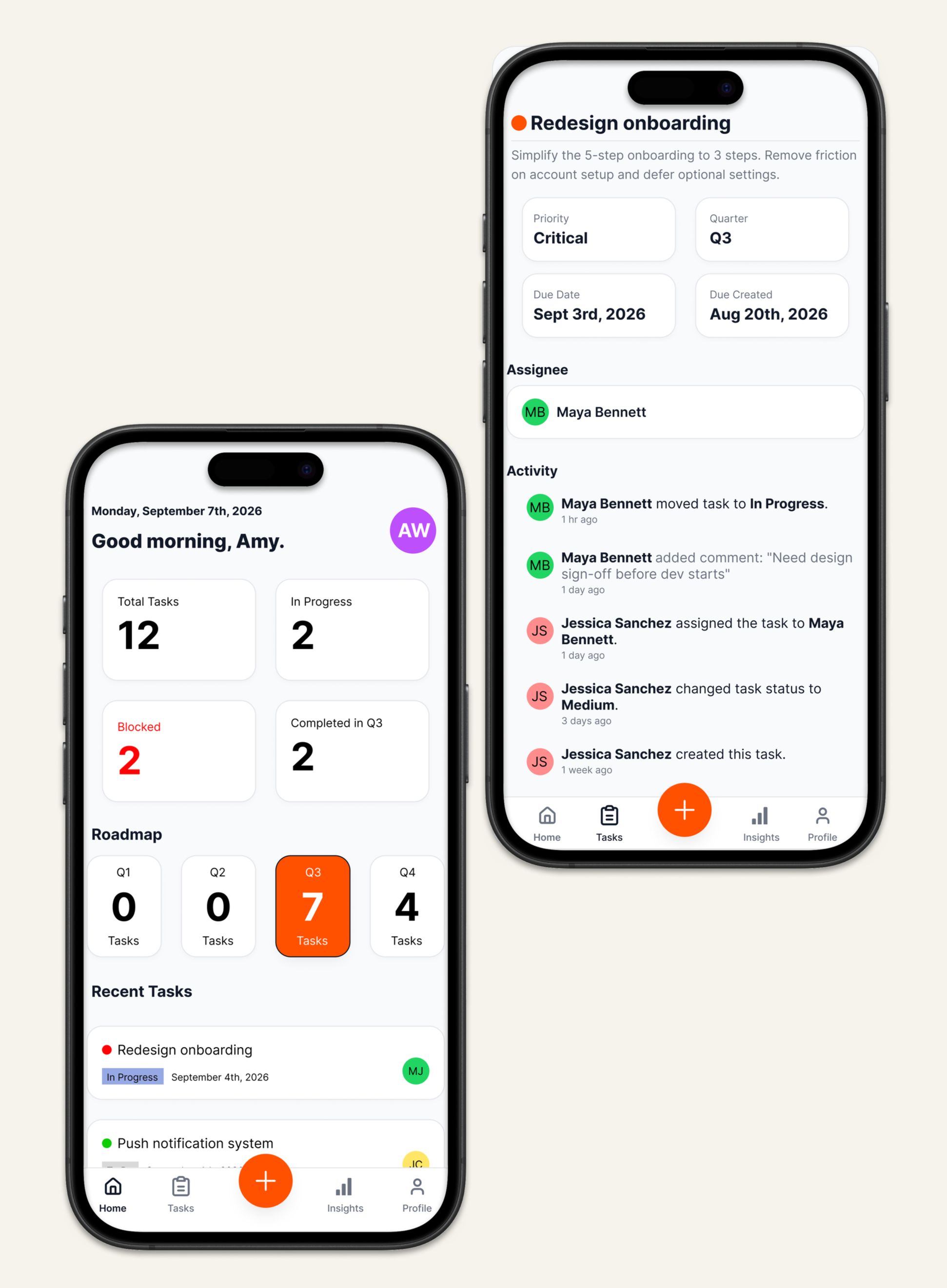
Overview & Objective
ProDiMa is a mobile product management app built for employees who manage roadmaps between meetings, not at a desk. The challenge: design a task management flow that shows dense, high-stakes information — status, priority, ownership — on a small screen, without ever feeling cluttered or forcing users to dig for what matters.
I designed the full end-to-end flow — dashboard, task list, task detail, and a guided task-creation flow — in a single day, using Figma Make to move from lo-fi wireframes to a polished, high-fidelity design fast enough to stay within that constraint.
My Designs
-
![]()
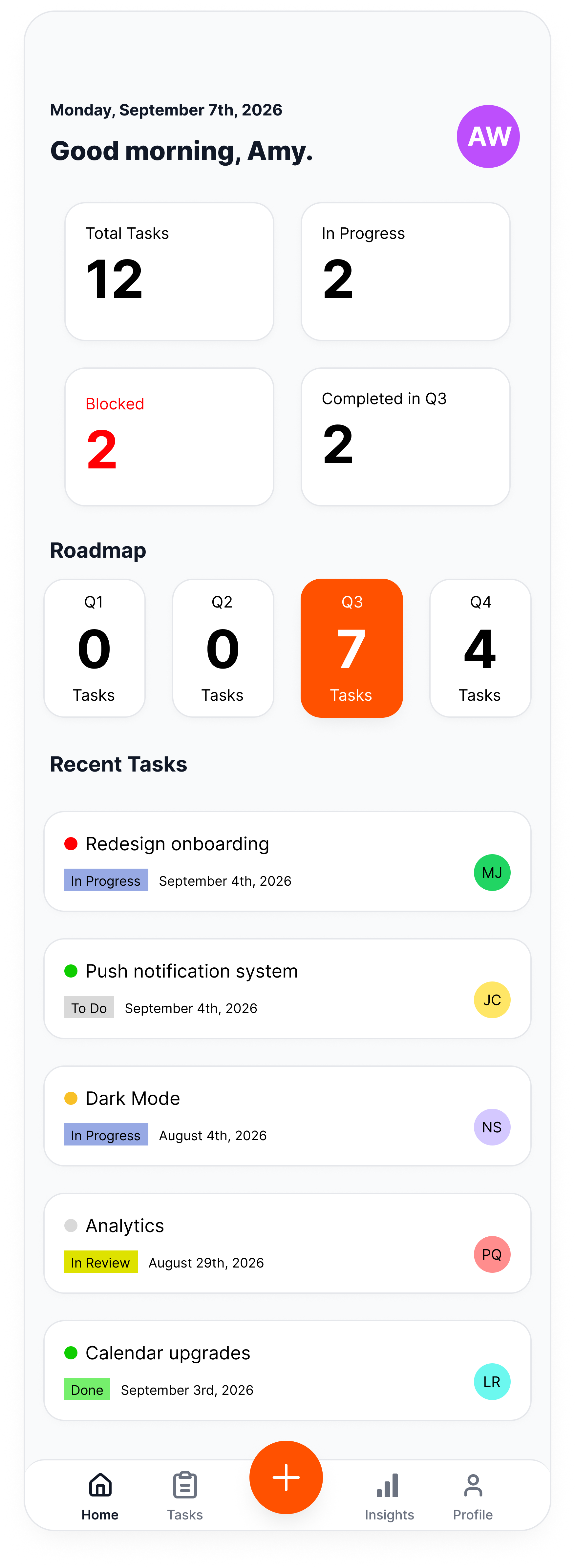
Dashboard
-
![]()
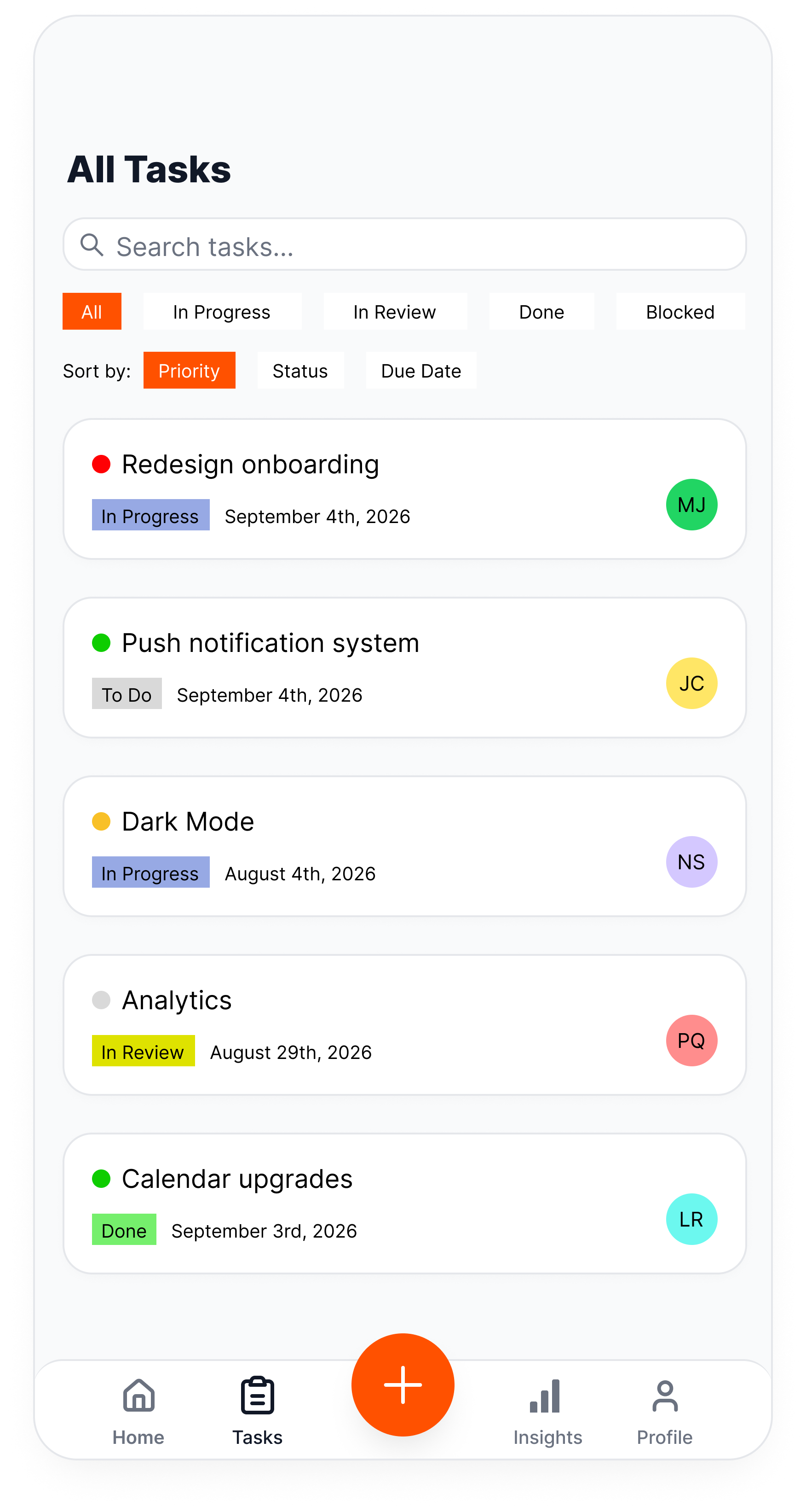
All Tasks
-
![]()
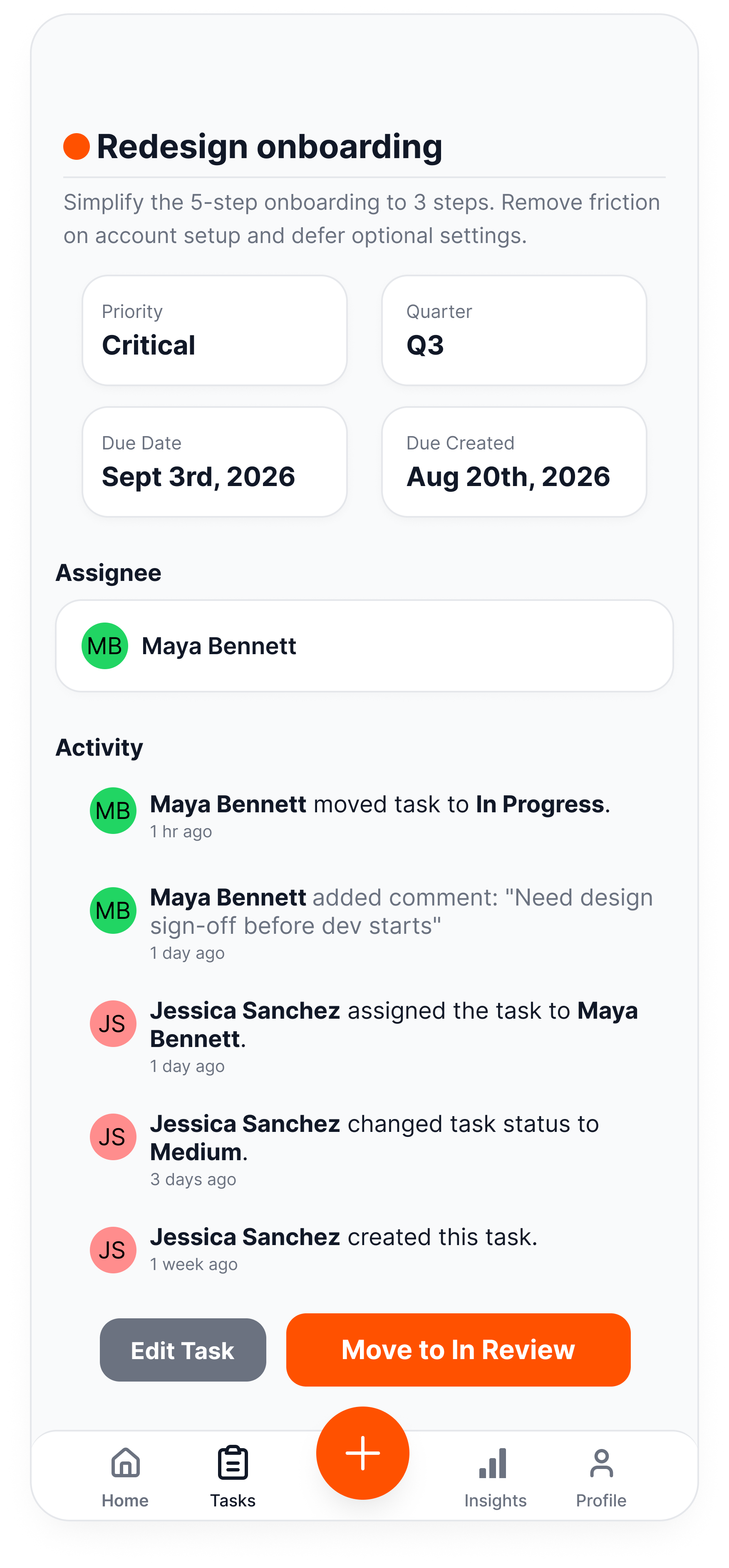
Individual Task
-
![]()
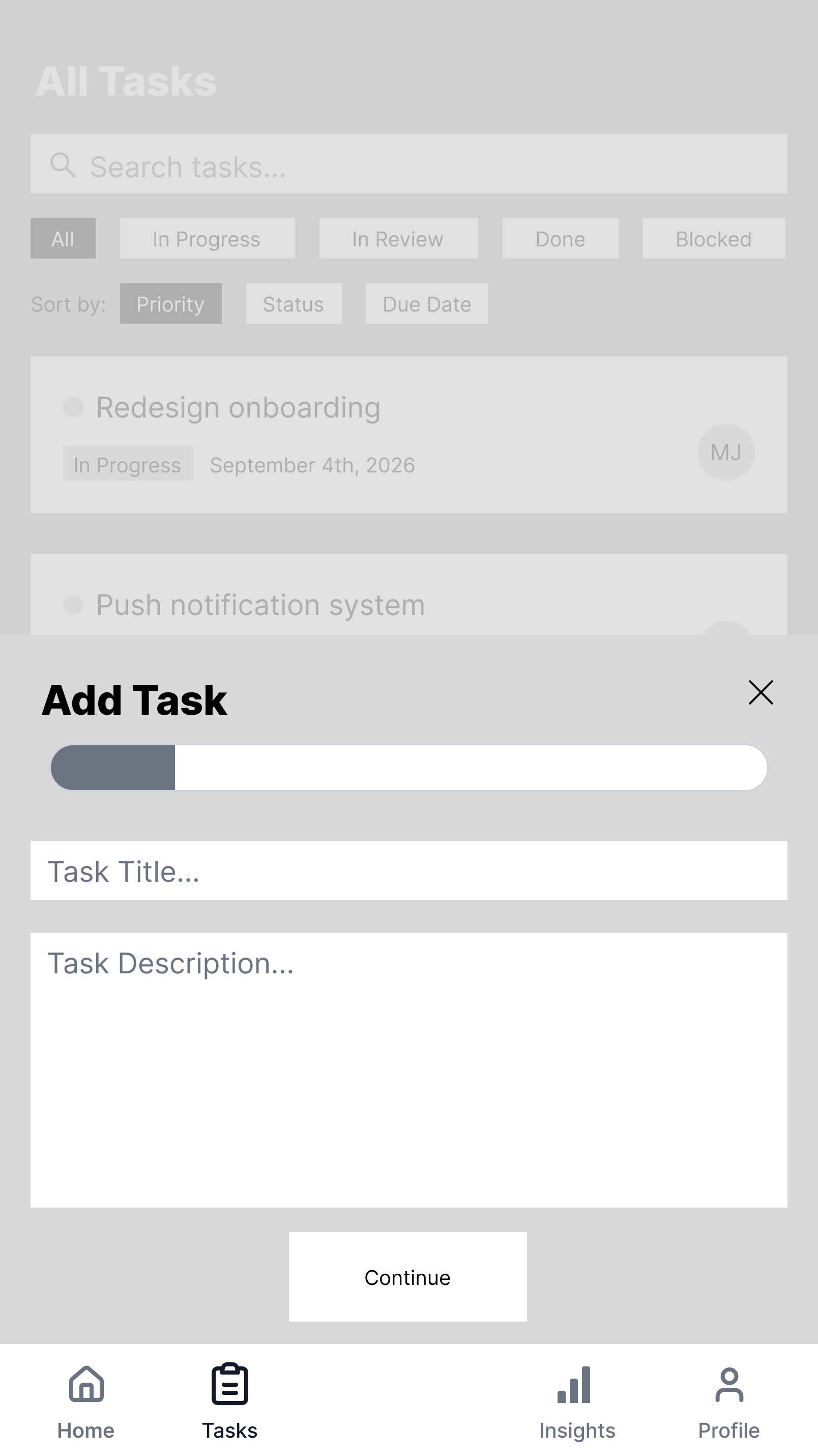
Add Task - Step 1
-
![]()
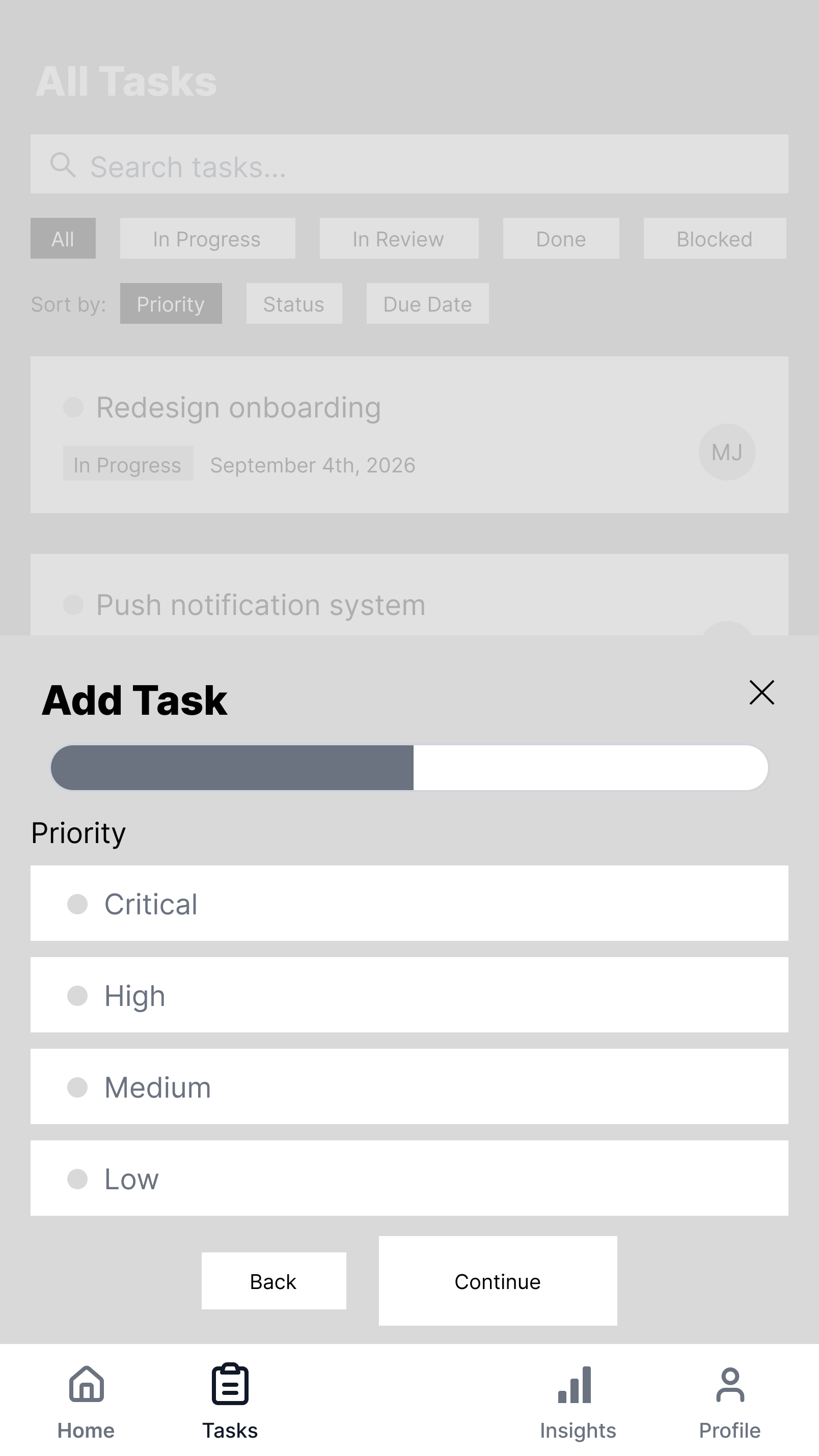
Add Task - Step 2
-
![]()
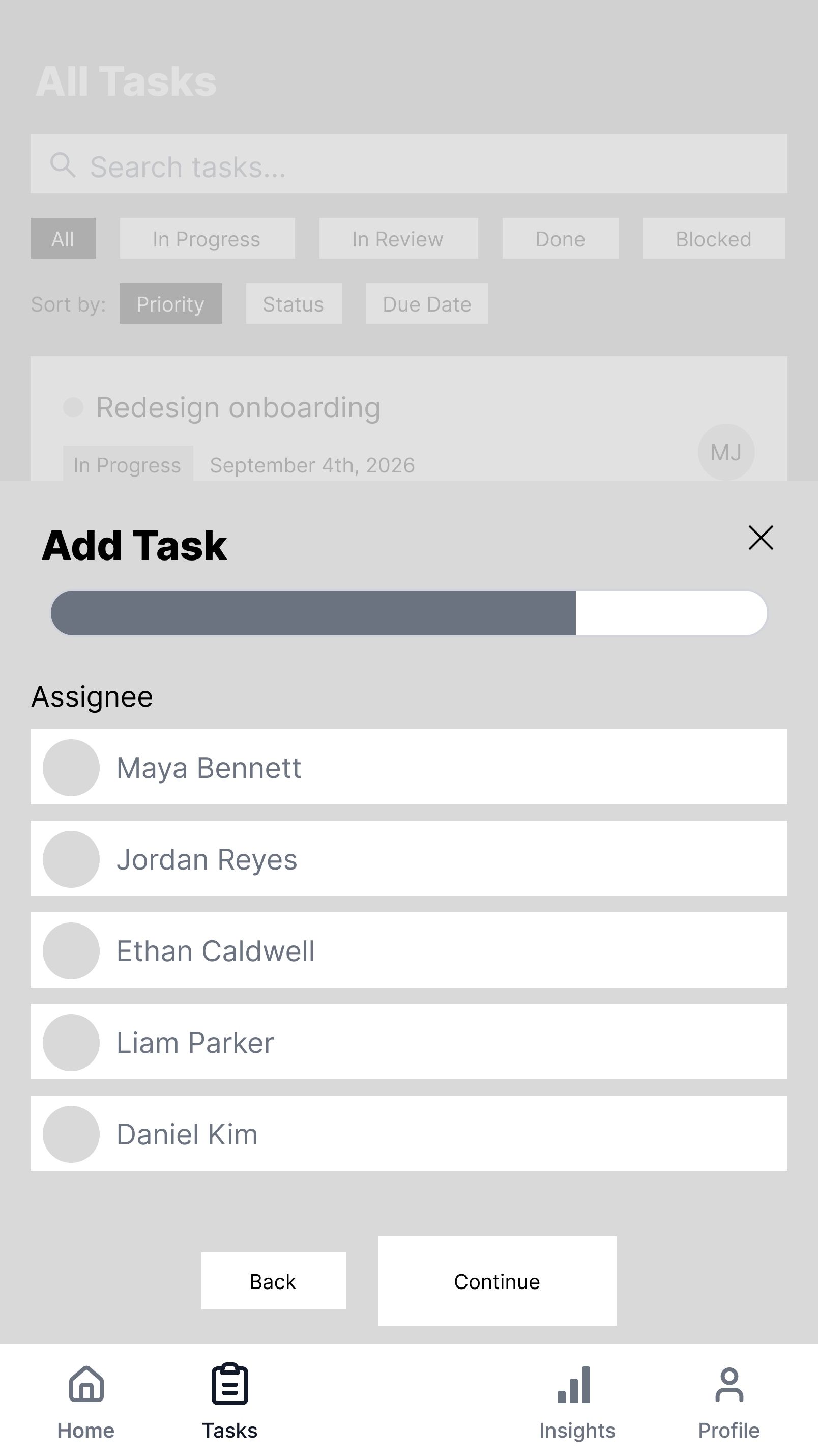
Add Task - Step 3
-
![]()
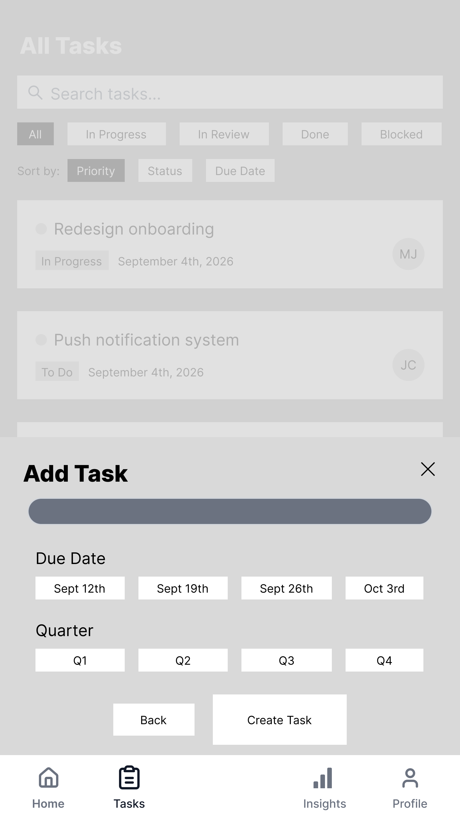
Add Task - Step 4
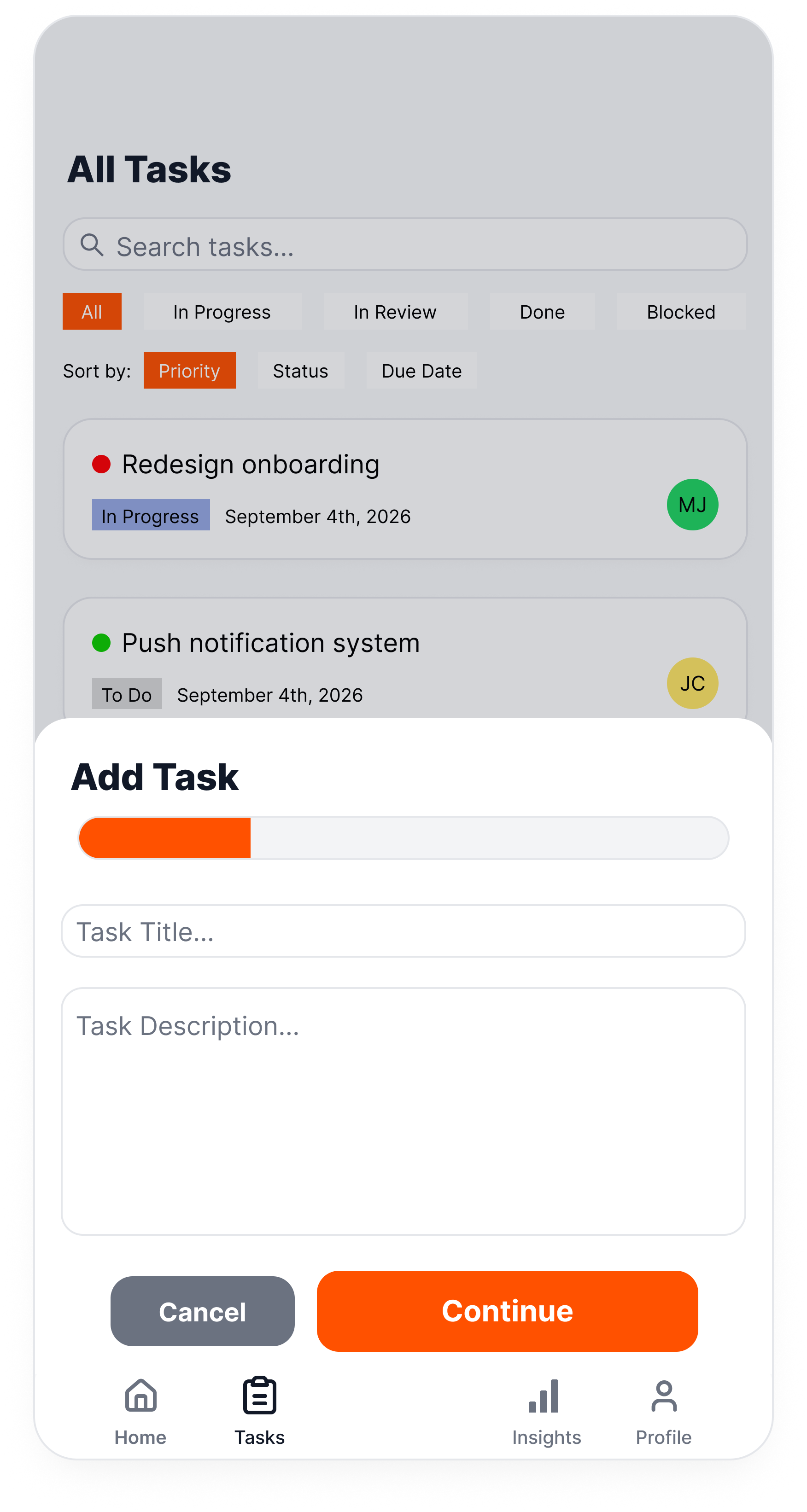
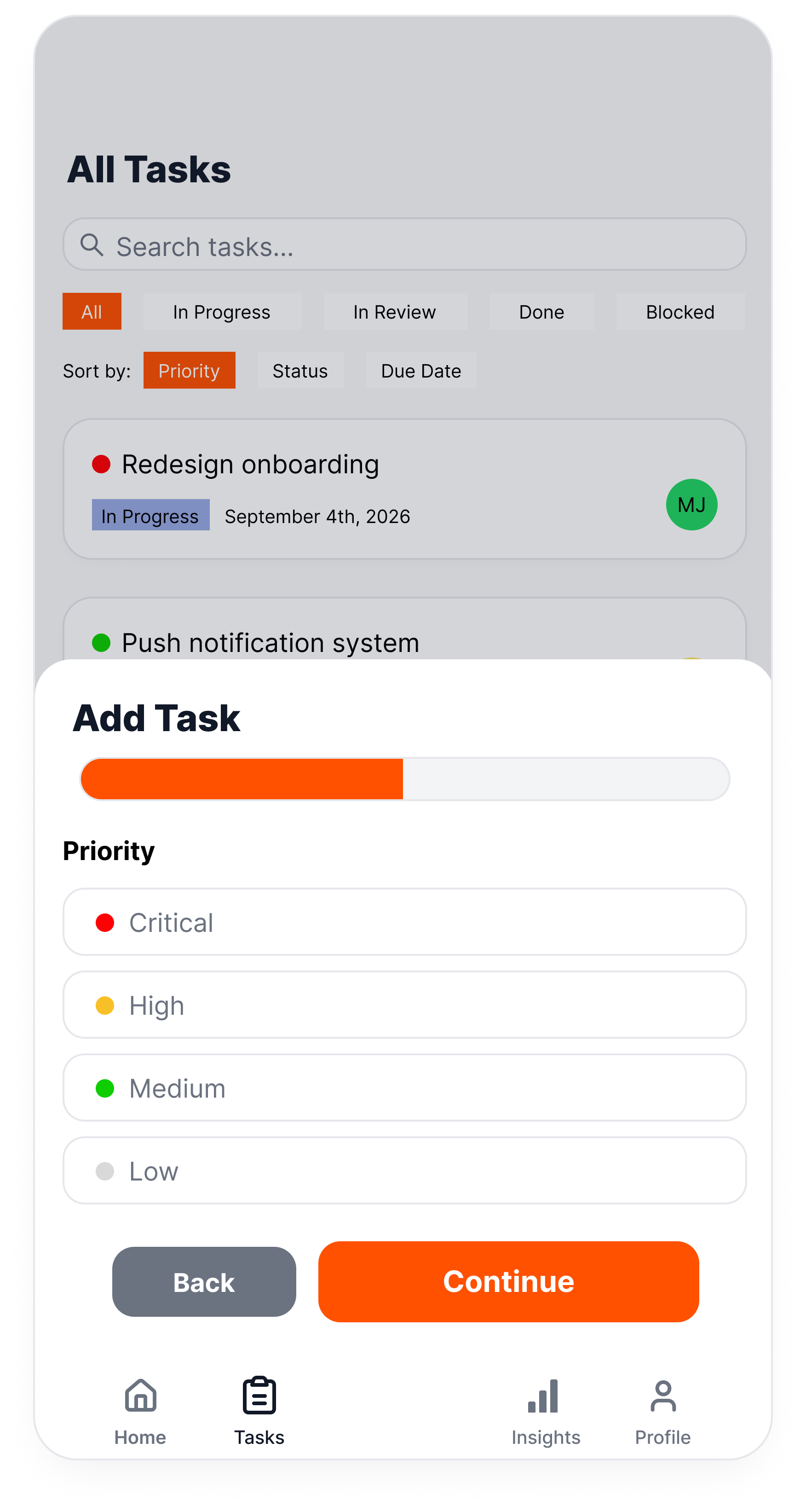
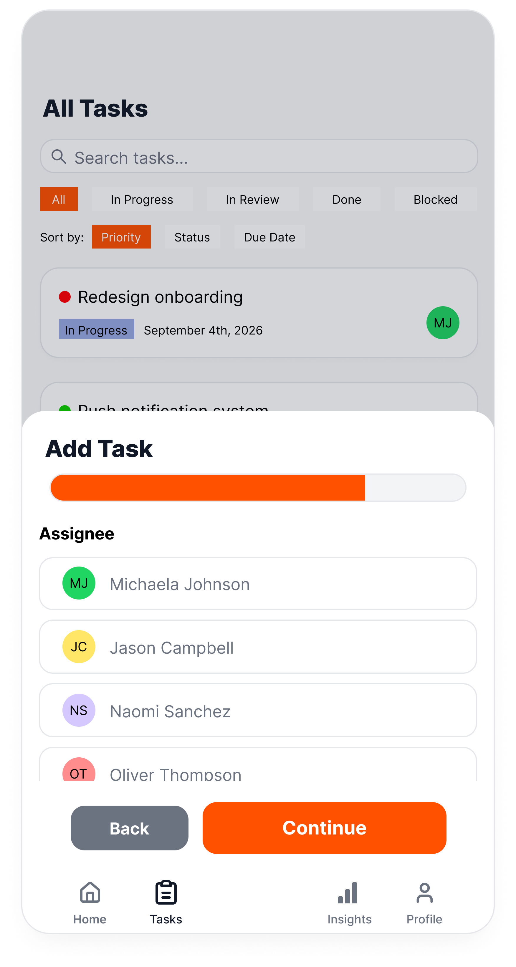
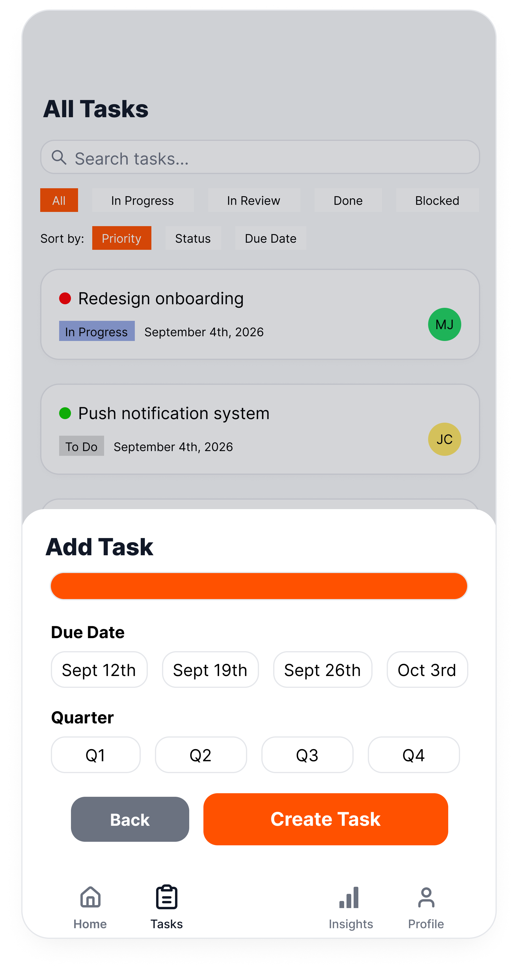
Creating Hi-Fi Wireframes with Figma Make
With the lo-fi structure validated, I used Figma Make to accelerate the jump to high-fidelity — turning wireframes into a fully polished, color-coded design system within the same day. This let me spend my limited time on design decisions (color language, information hierarchy, interaction details) rather than on manually rebuilding every screen from scratch.
Key Design Decisions
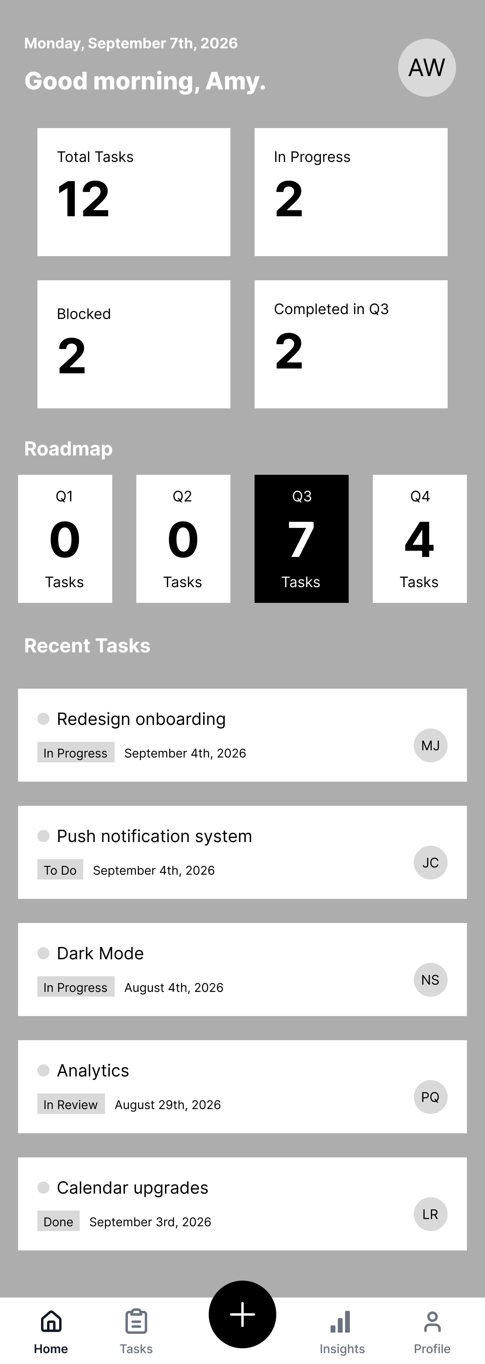
Dashboard as a 5-second health check. The Dashboard surfaces the four numbers that matter most at a glance — Total, In Progress, Blocked, Completed — alongside a quarterly roadmap breakdown. A user can assess project health without navigating anywhere.
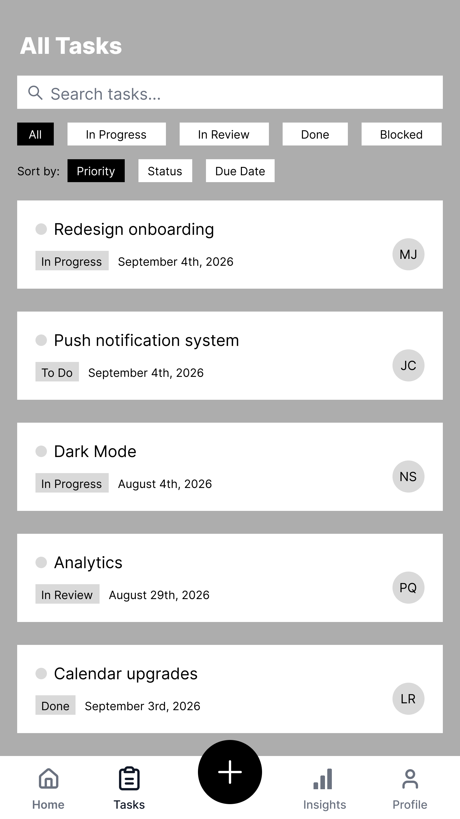
Color as a consistent status language. Priority and status are encoded through color-coded dots and tags across every screen — the task list, the Add Task flow, and Task Detail all share the same visual system. This keeps critical information visible at a glance instead of buried in text, directly reducing the cognitive load of scanning a dense list.
A four-step Add Task flow, not one long form. Adding a task is broken into four short, focused steps — Title/Description → Priority → Assignee → Due Date/Quarter — instead of one long form. Each step asks for a single decision, matching how mobile users actually input information: in short, interruptible bursts. A progress bar keeps users oriented on how much is left.
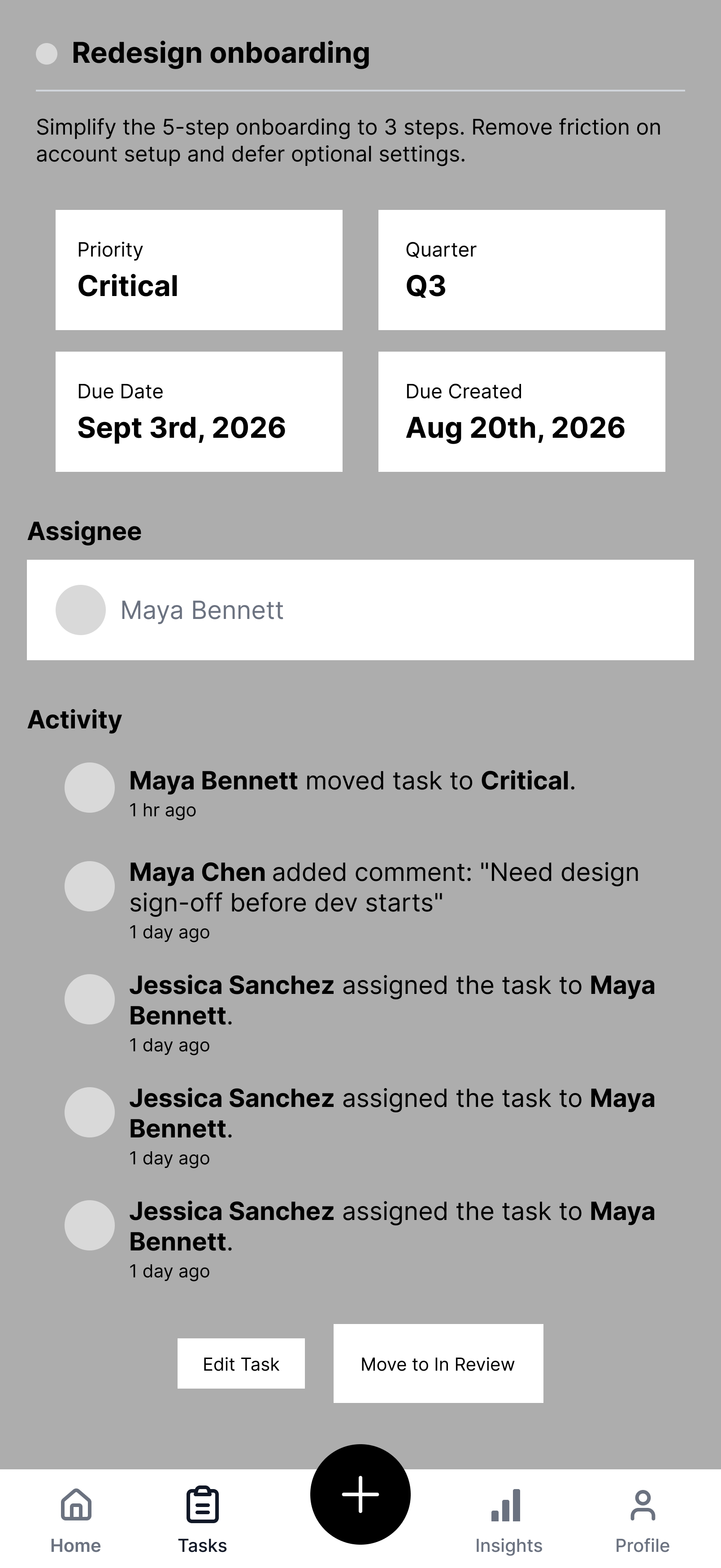
Task Detail as the "deep data" counterpart to the dashboard. The Task Detail screen intentionally surfaces every piece of density the brief called for — priority, quarter, due date, creation date, assignee, and a full activity log. "Browse at a glance" and "deep data density" are two different needs; collapsing them into a single view would have sacrificed one for the other. Task Detail exists so nothing is lost when a user needs to go deep.
Designed around real productivity behavior, not assumed behavior. Three specific choices came directly from how these users actually work:
The guided Add Task flow trades one long form for four short steps completable one-handed with partial attention.
Filtering and sorting live at the top of the task list, so users can immediately narrow to what's relevant to their current context (e.g., filtering to "Blocked" before a standup).
The Recent Tasks widget on the Dashboard surfaces the most likely next action without requiring navigation, since users often return to the same 2–3 tasks repeatedly throughout the day.
The Initial Design Problem
Most product management tools are built for desktop, where screen space makes information density easy. On mobile, that same density either gets stripped away (losing critical context) or crammed in (creating clutter). Neither works for someone checking their roadmap in a 30-second window between meetings.
The brief asked for a flow that does two things at once, without compromising either:
Let users browse all tasks at a glance
Guide users through adding a task with a simple, low-friction process
Never bury critical information — status, priority, ownership — no matter how dense the data gets
Who I Designed For
On-the-go product and project professionals who check and update their roadmap in short bursts throughout the day — between meetings, while commuting, or during quick status check-ins — rather than sitting down for extended planning sessions on desktop. These users need to make fast decisions (what's blocked, what's due, who owns what) without opening a laptop.
That single insight — short, frequent touchpoints, not long sessions — became the filter every design decision had to pass through.
Design Process
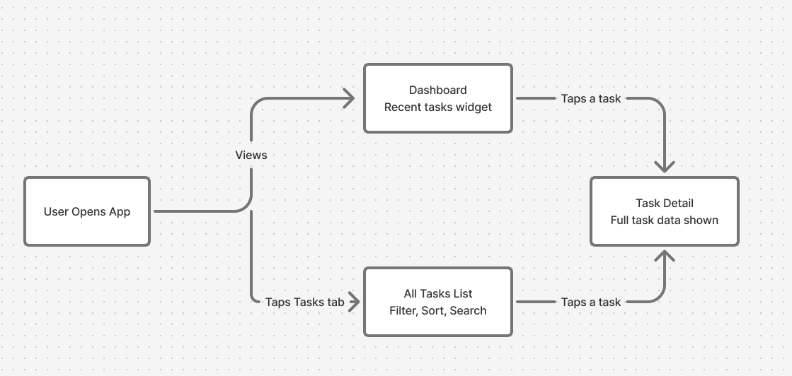
Before touching any screens, I mapped the core user flow: a user opens the app, either lands on the Dashboard or taps into the Tasks tab, and from either path can drill into a Task Detail view. Establishing this early made sure every screen I designed had a clear entry and exit point, rather than designing screens in isolation.
Lo-Fi Wireframes
I roughed out seven core screens in grayscale — Dashboard, All Tasks list, an individual task, and the four-step Add Task flow — focusing purely on layout and information hierarchy before any visual design. This let me test whether the structure worked before spending time on polish.
-
![]()
Dashboard
-
![]()
All Tasks
-
![]()
Individual Task
-
![]()
Add Task - Step 1
-
![]()
Add Task - Step 2
-
![]()
Add Task - Step 3
-
![]()
Add Task - Step 4
Outcome
Within the 1-day constraint, I delivered:
A complete user flow covering dashboard, browsing, filtering, task creation, and task detail
Lo-fi wireframes for every screen in the journey
A polished, high-fidelity design for the full end-to-end flow
A consistent color-coded status system applied across every screen
Using Figma Make to accelerate the lo-fi-to-hi-fi transition was what made a genuinely complete, polished flow possible in a single day — time that would otherwise have gone into manual visual polish went into refining the actual interaction design instead.
Final designs are shown above on mobile.