
Job Application Redesign
The Bettinger Company — Internal UX Initiative
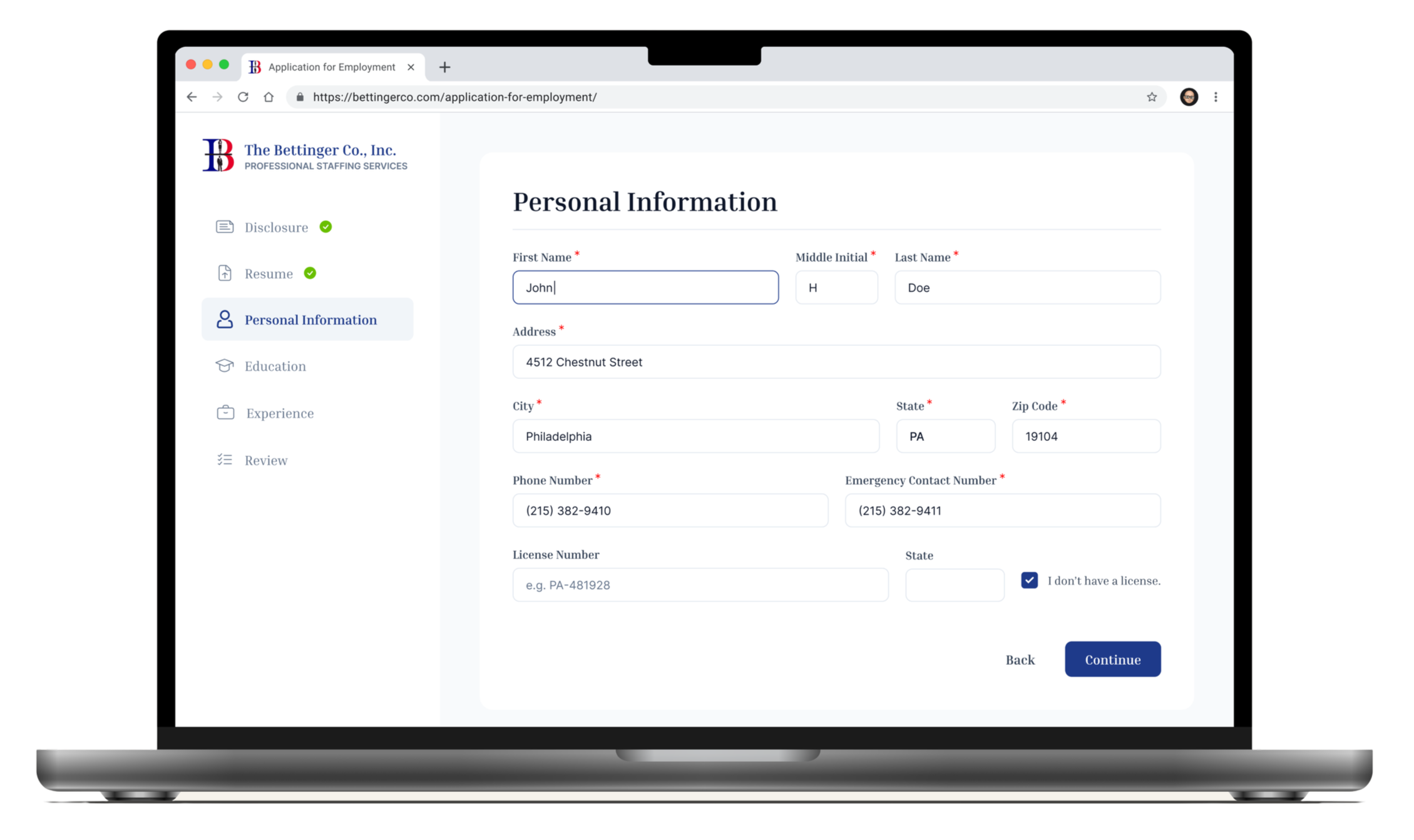
Final Designs
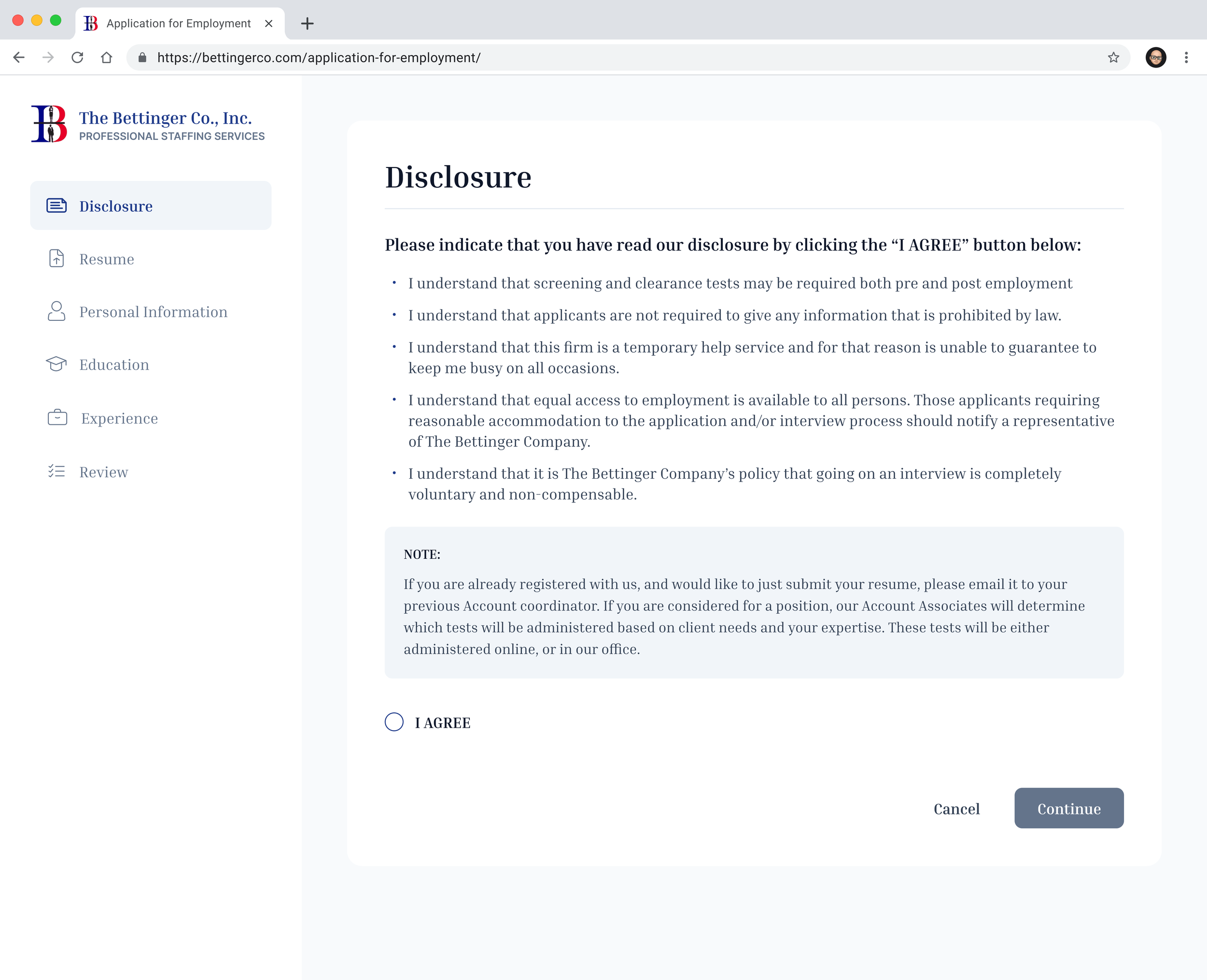
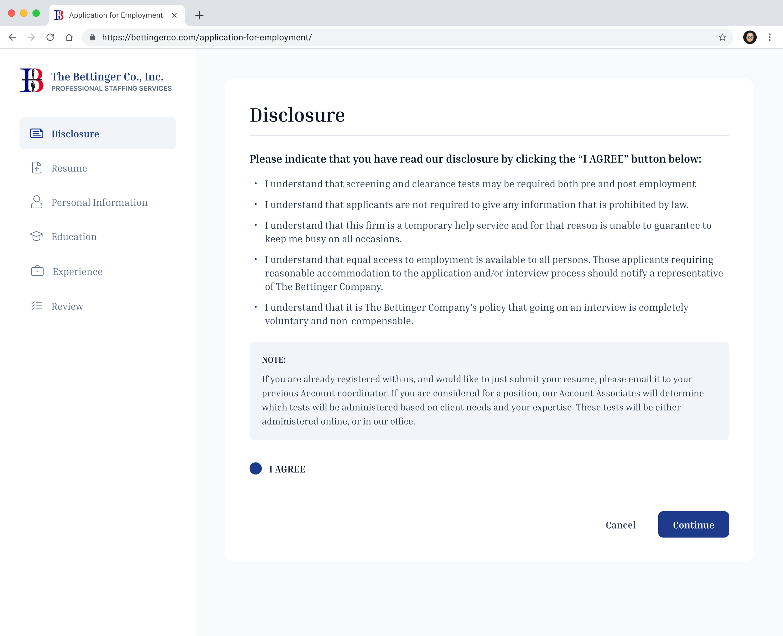
Disclosure
-
![]()
Disclosure - Unchecked
-
![]()
Disclosure - Checked
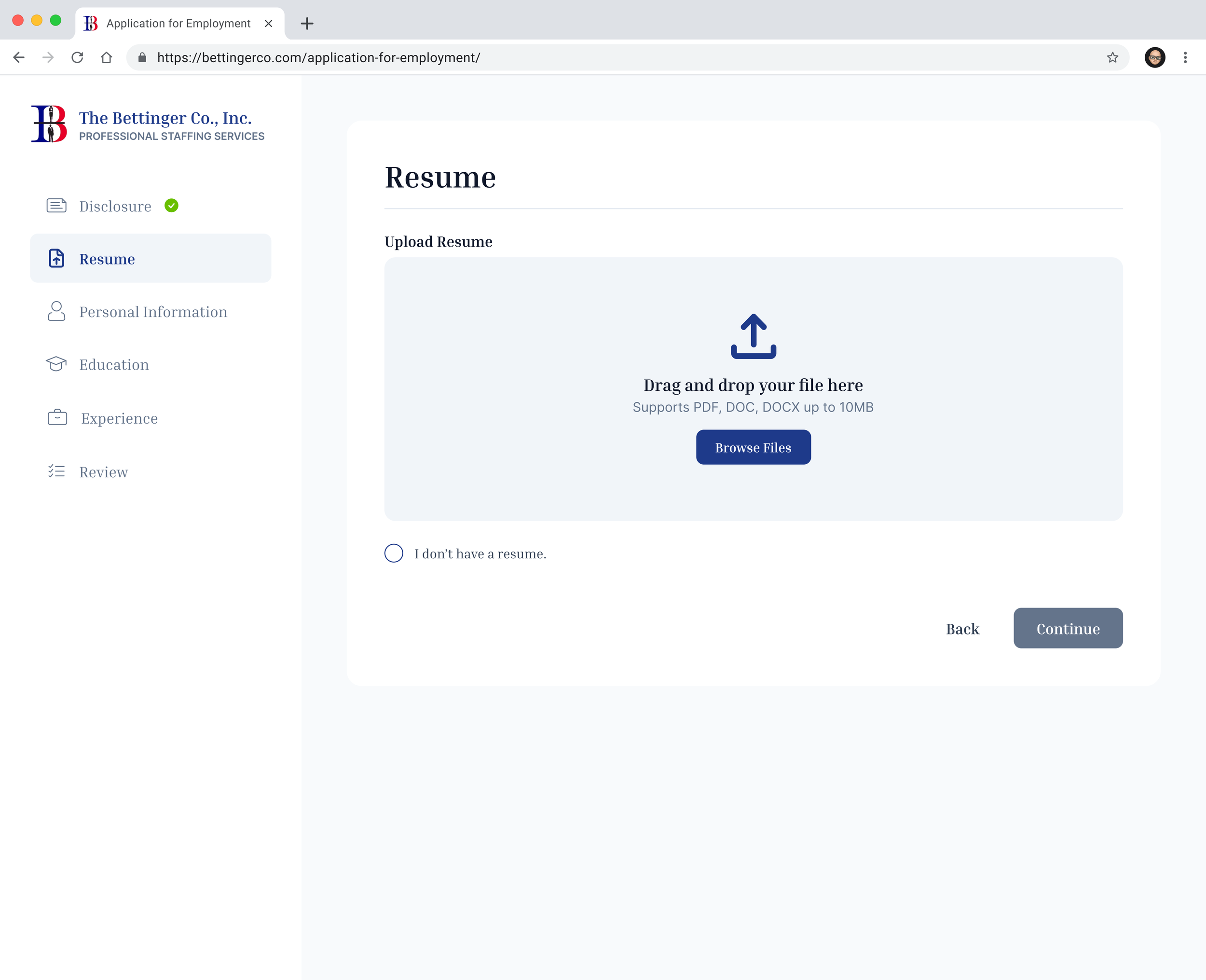
Resume
-
![]()
Resume - Empty State
-
![]()
Resume - Filled
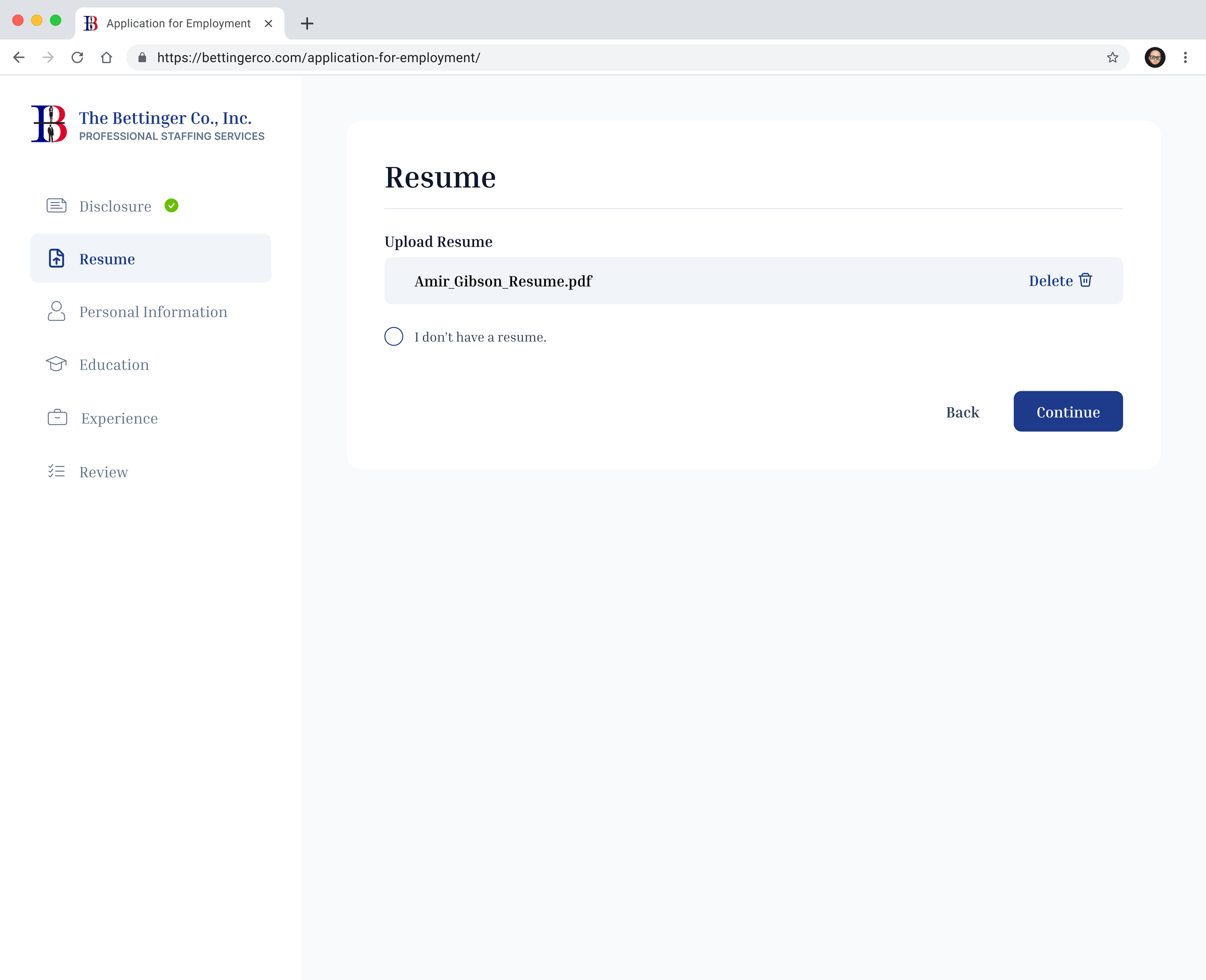
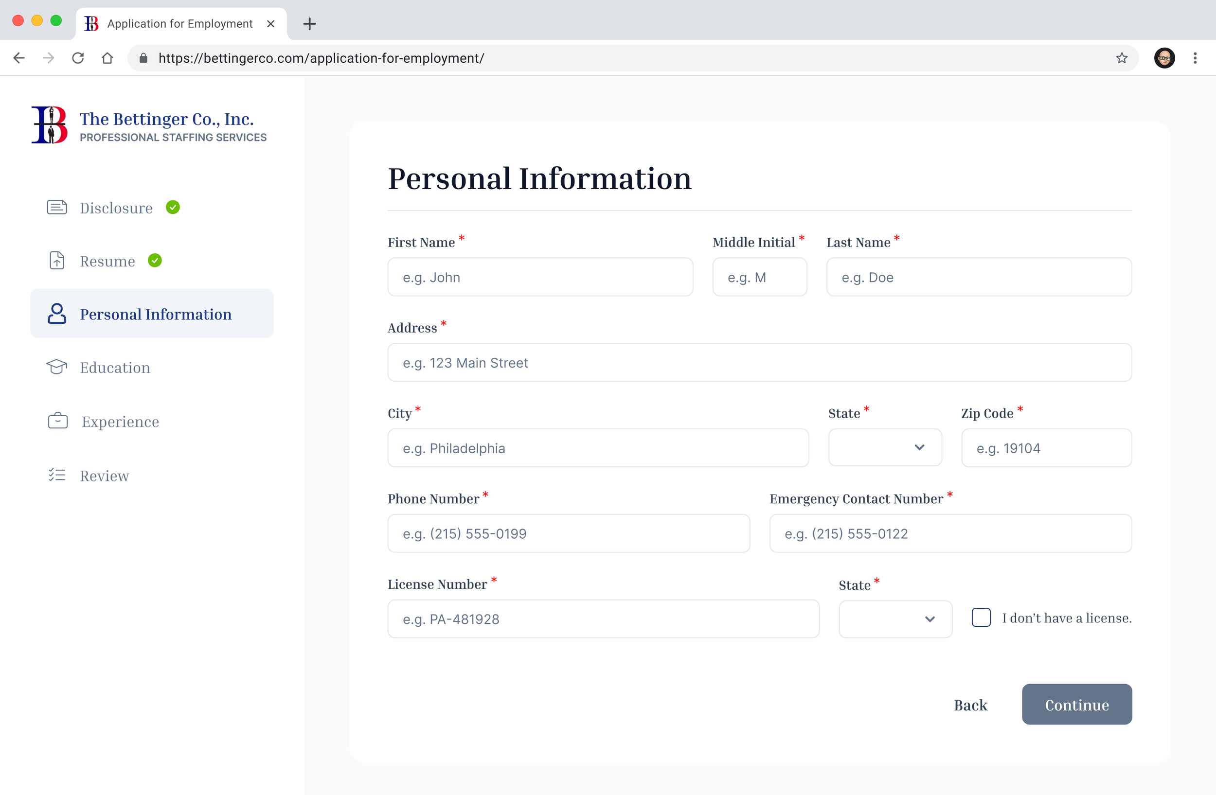
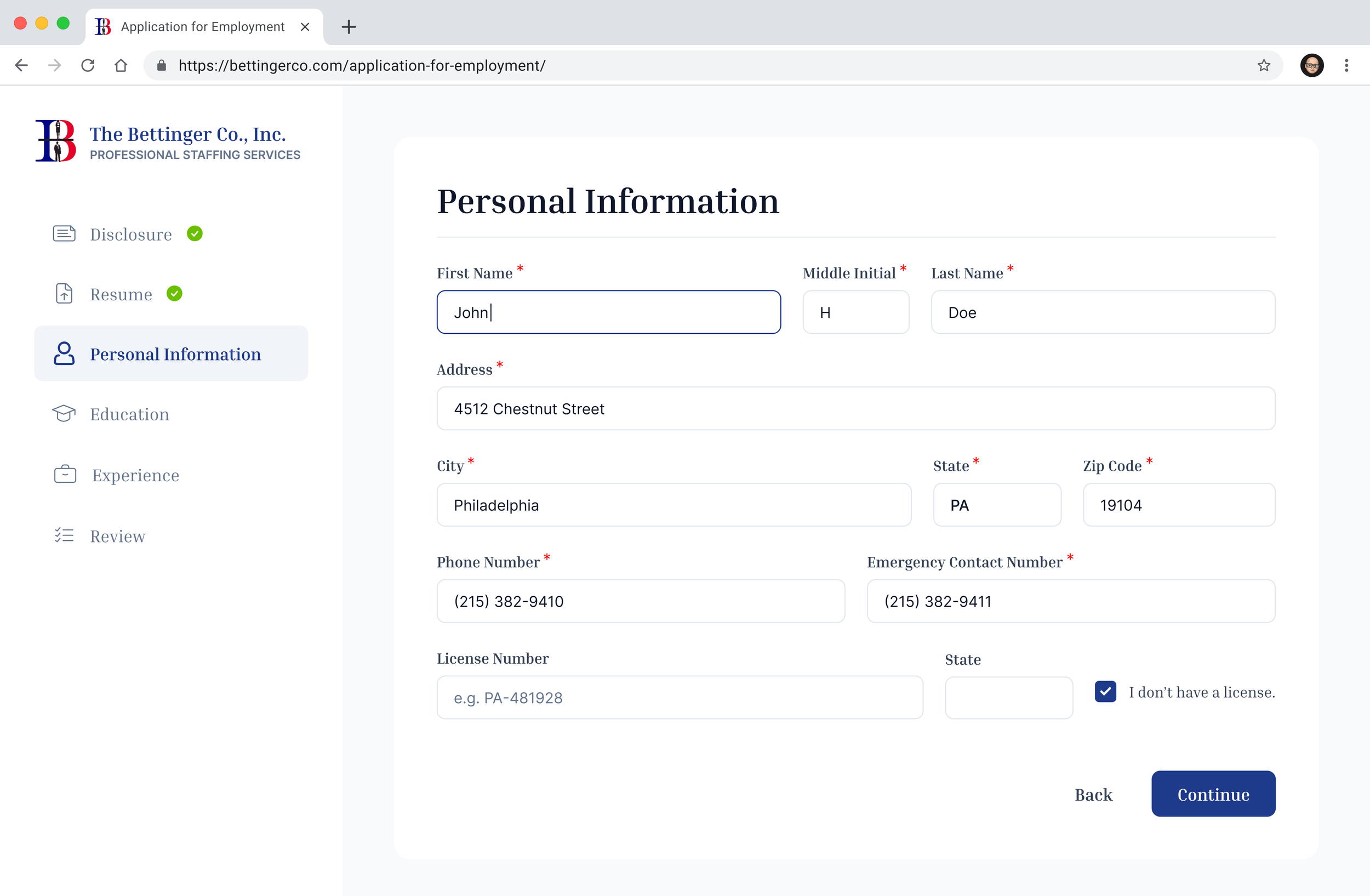
Personal Information
-
![]()
Personal Info - Empty State
-
![]()
Personal Info - Filled - Textbox Hover
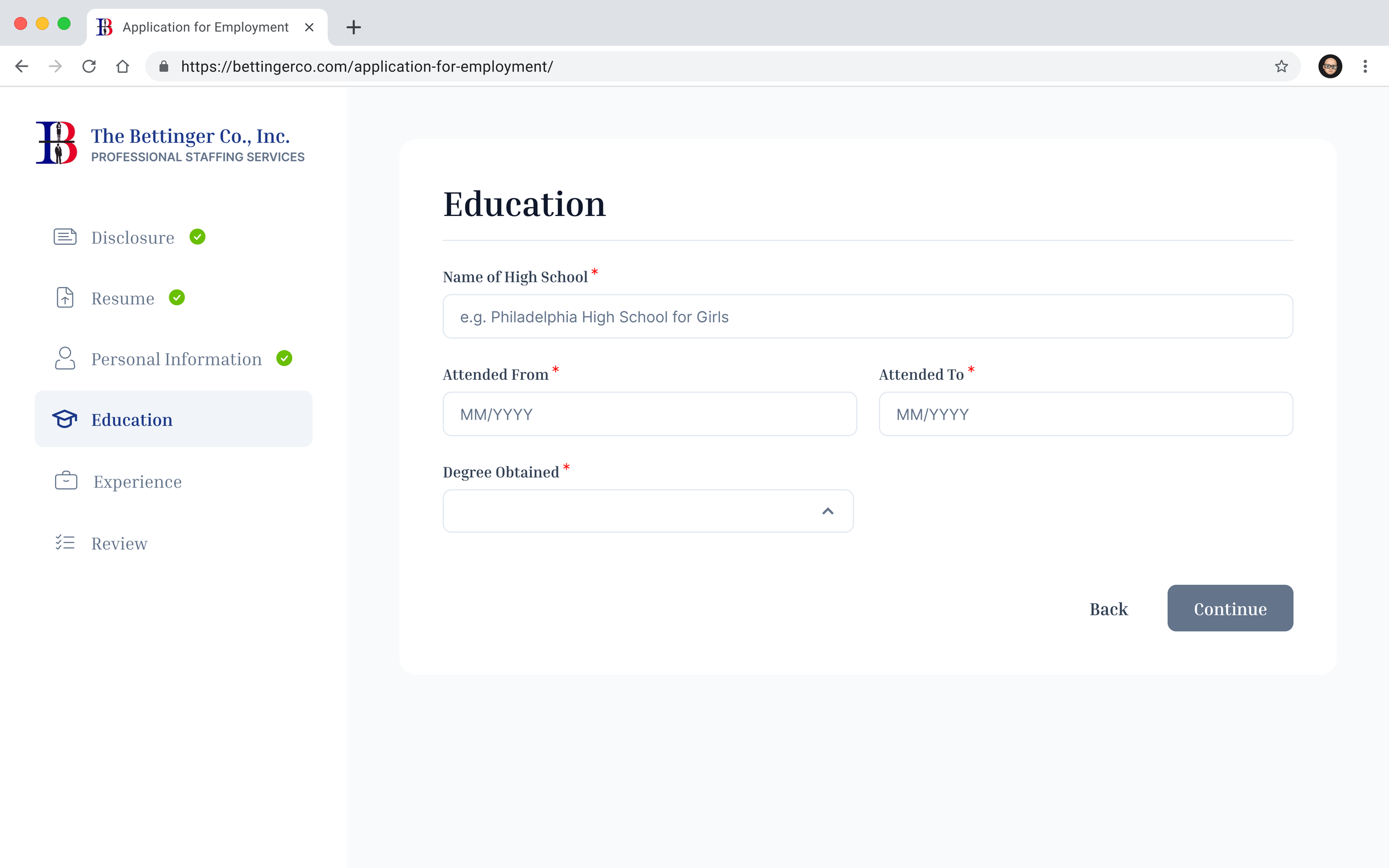
Education
-
![]()
Education - Empty State
-
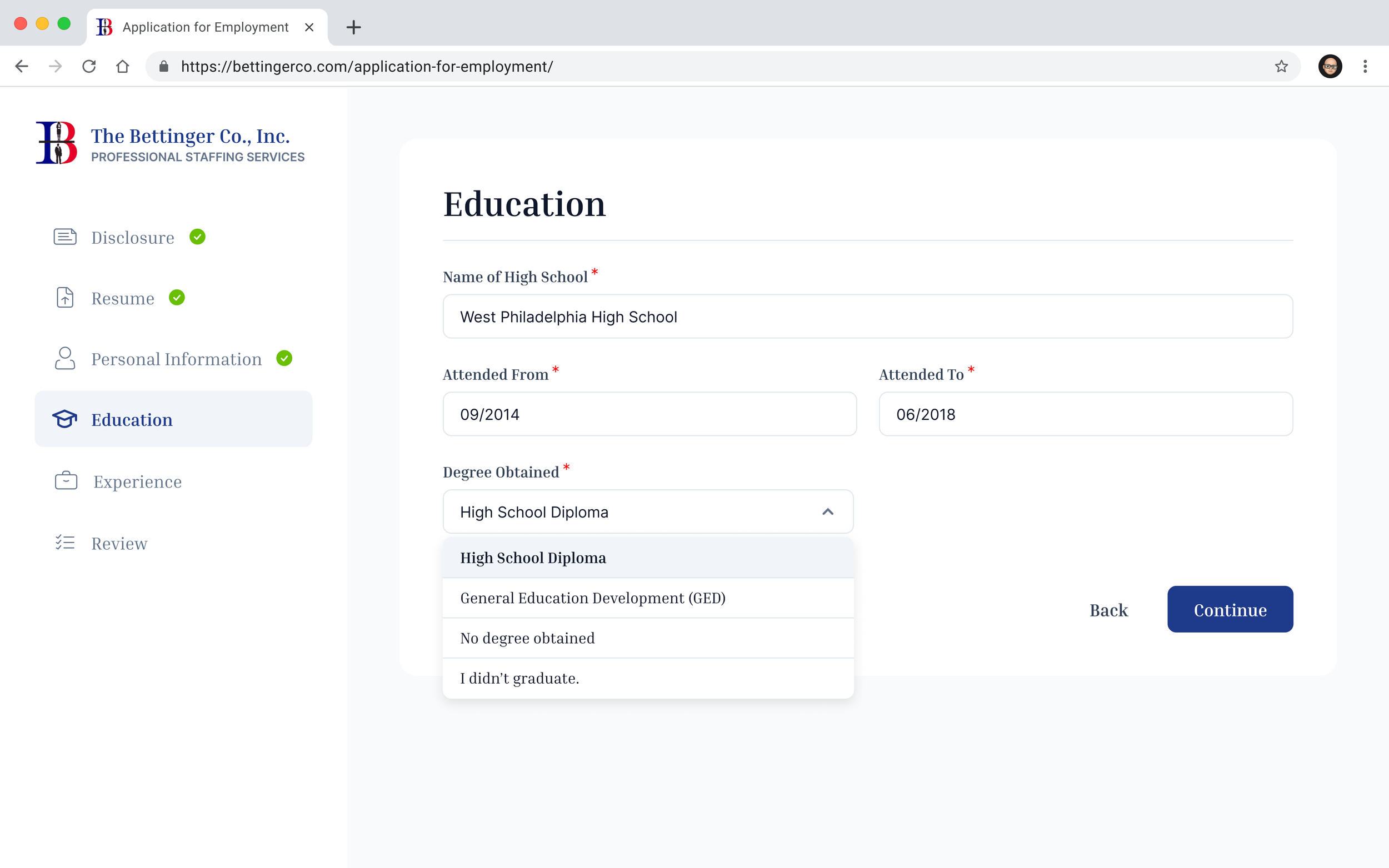
![]()
Education - Filled + Dropdown
-
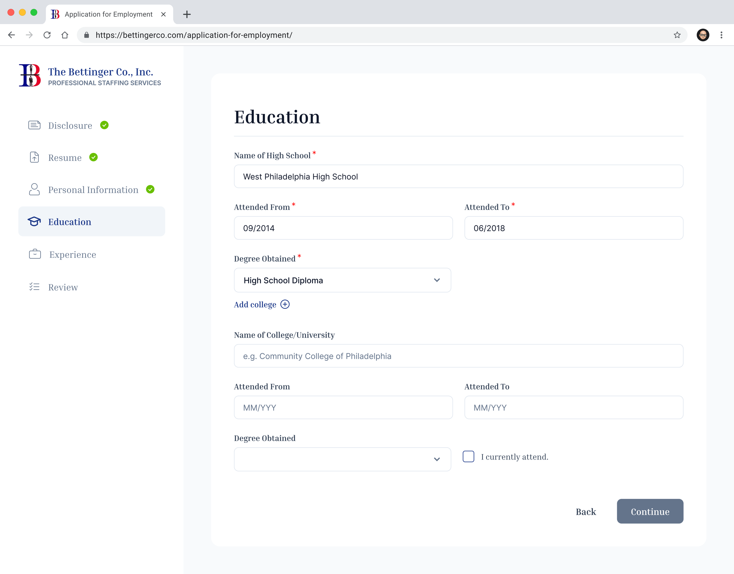
![]()
Education - College Addition
-
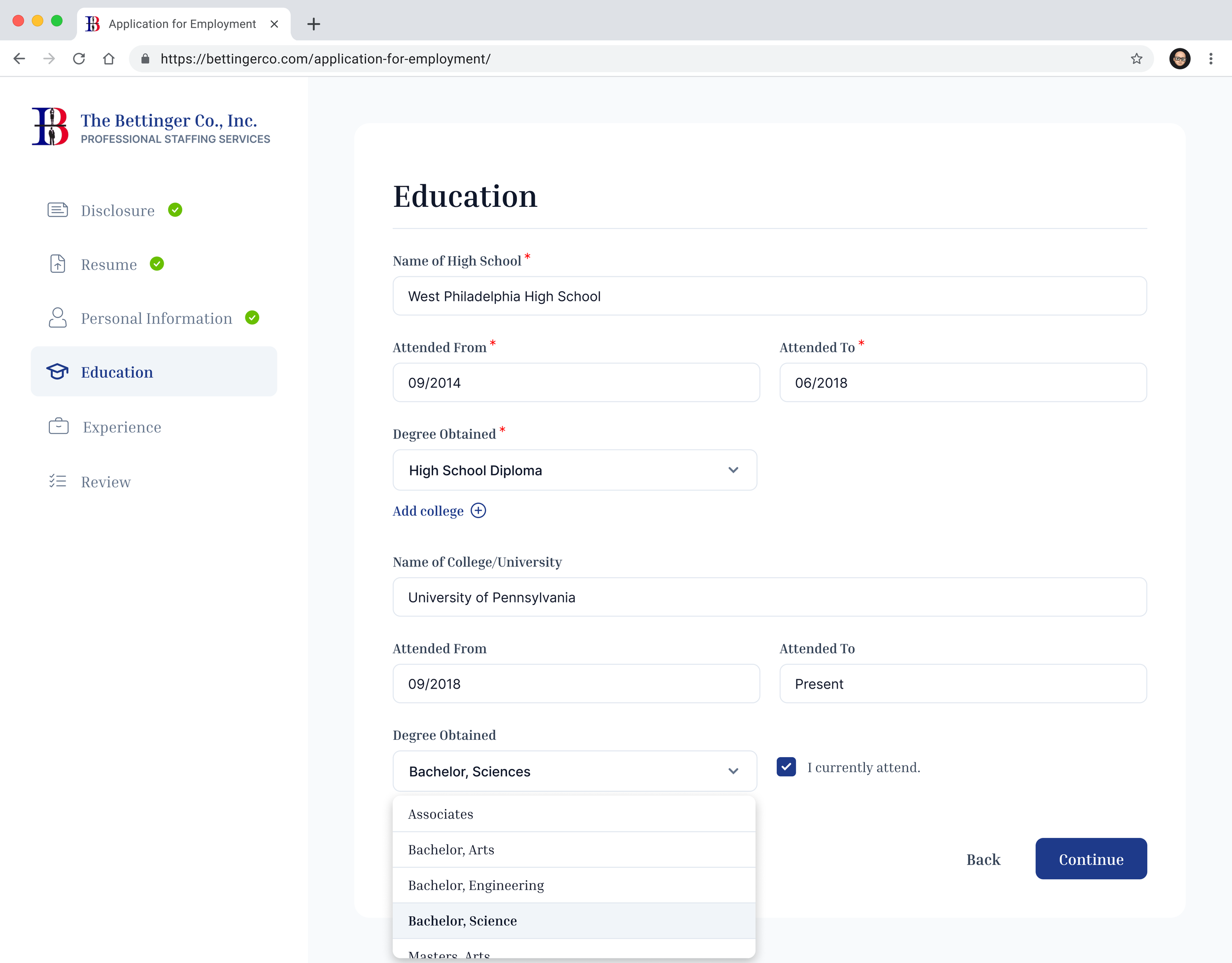
![]()
Education - College Addition - Filled + Dropdown
Experience
-
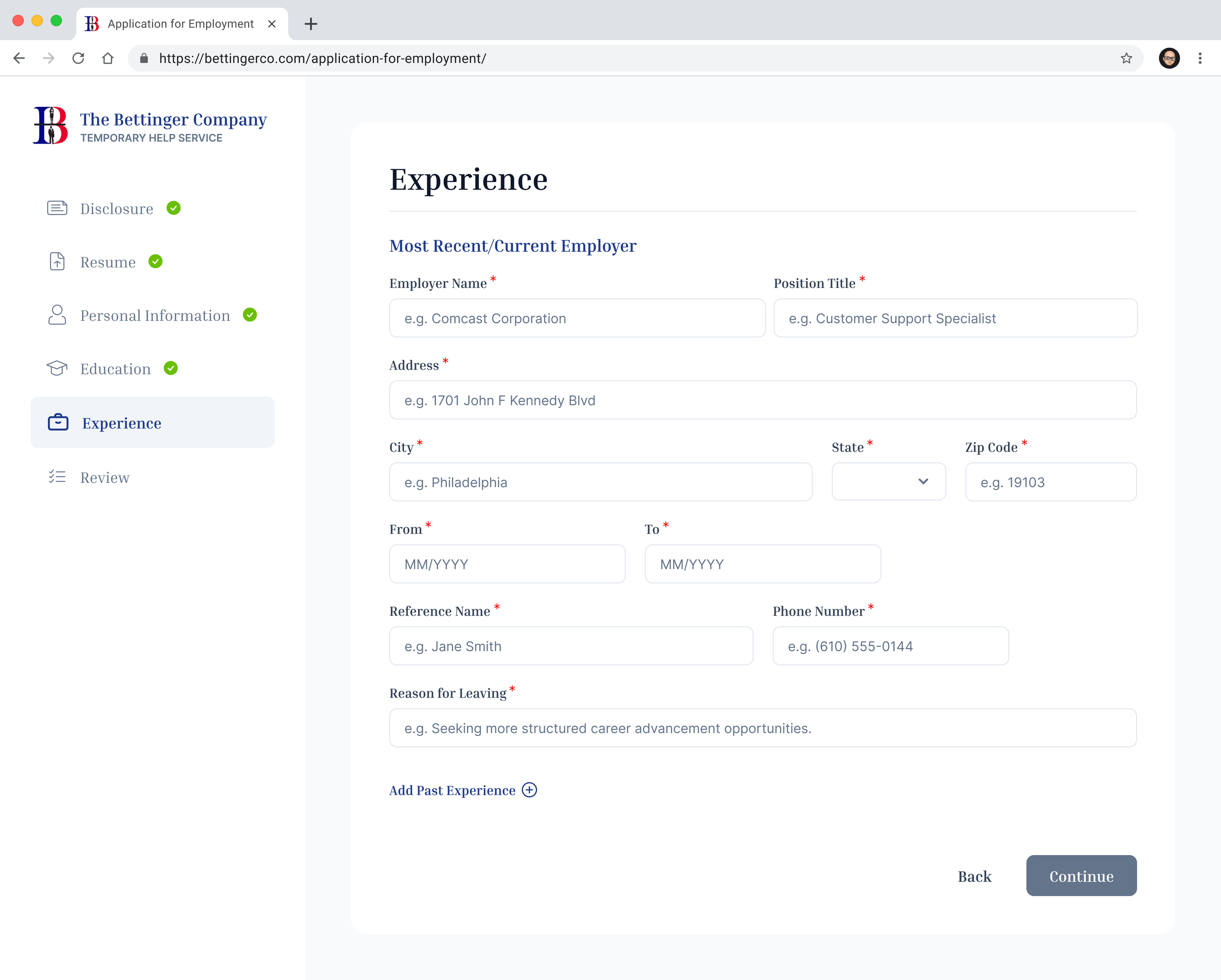
![]()
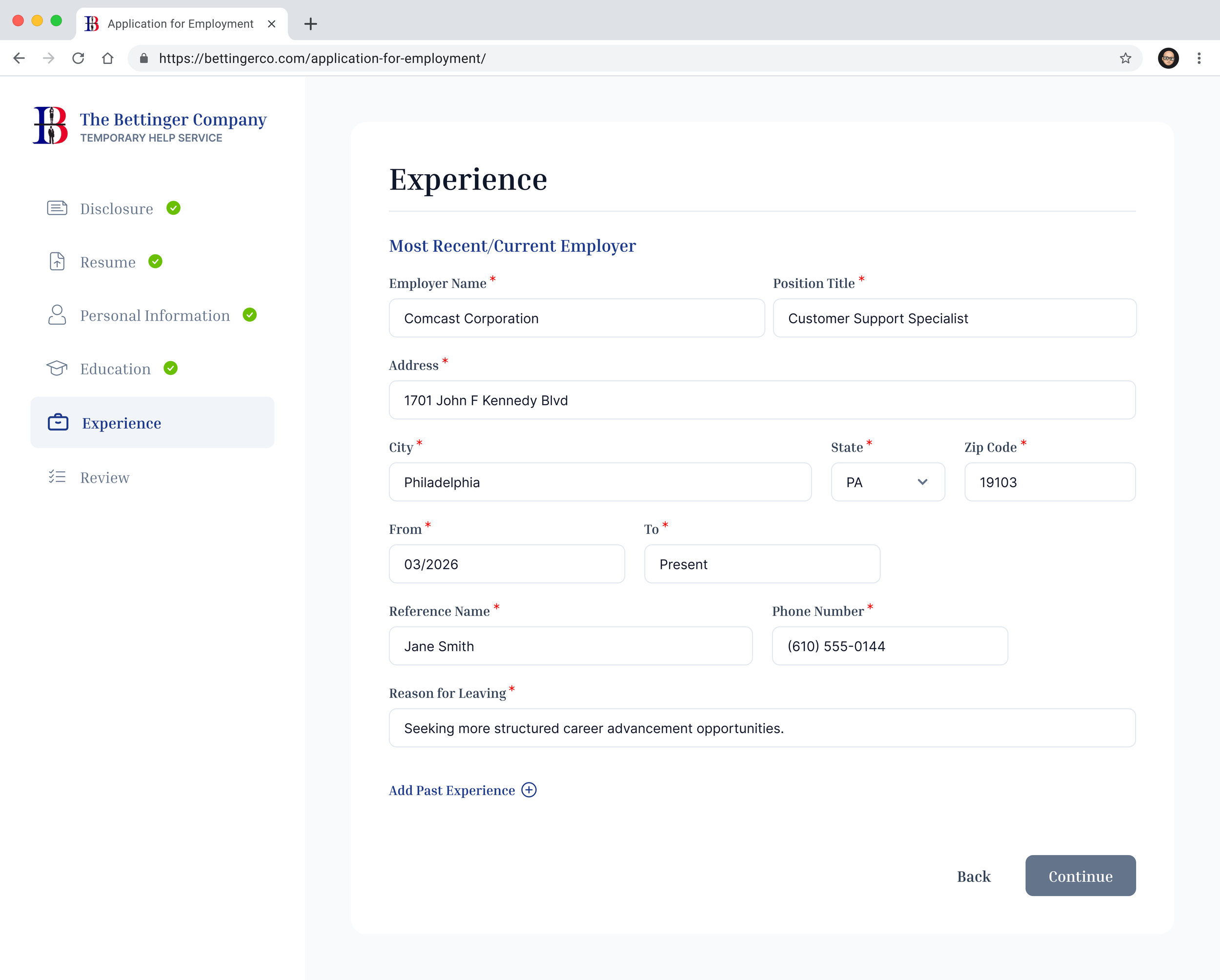
Experience - Empty State
-
![]()
Experience - Filled
-
![]()
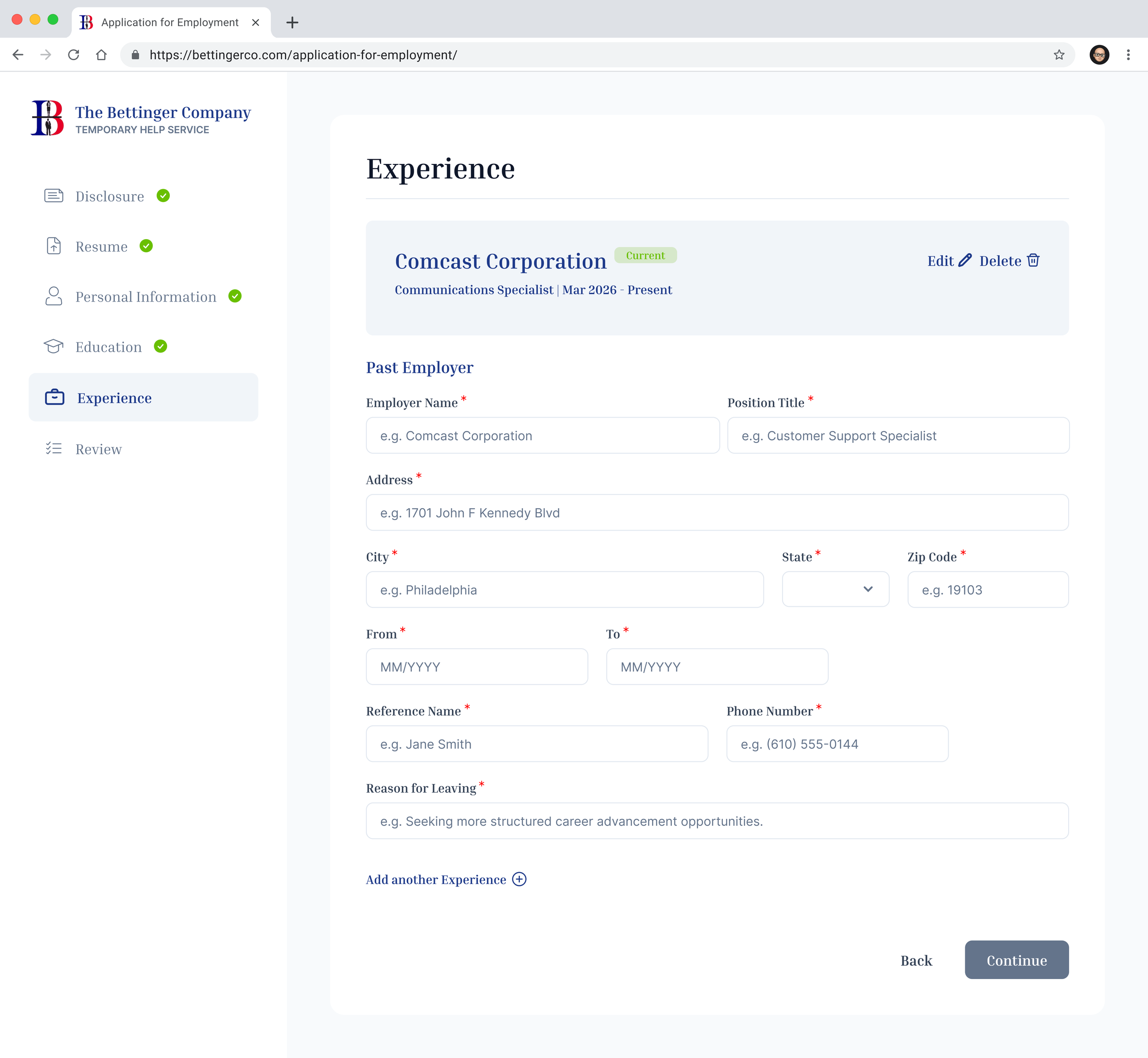
Past Experience - Empty State
-
![]()
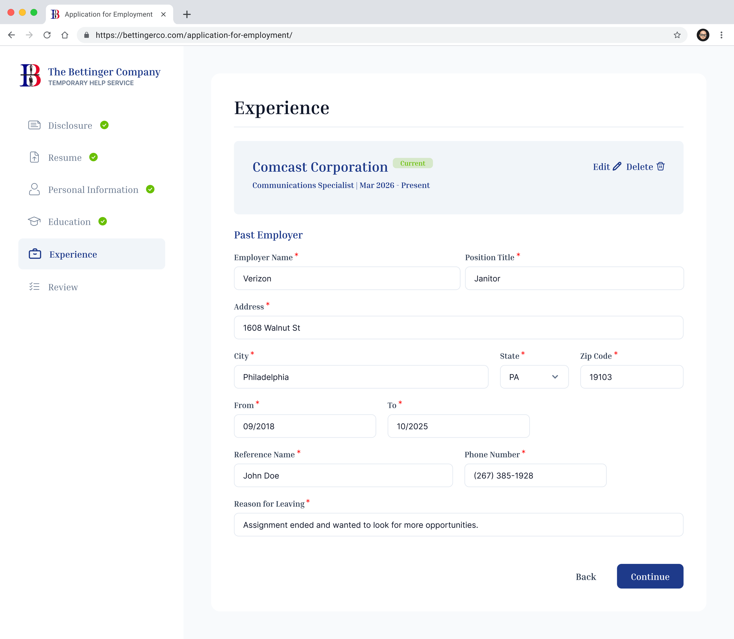
Past Experience - Filled
-
![]()
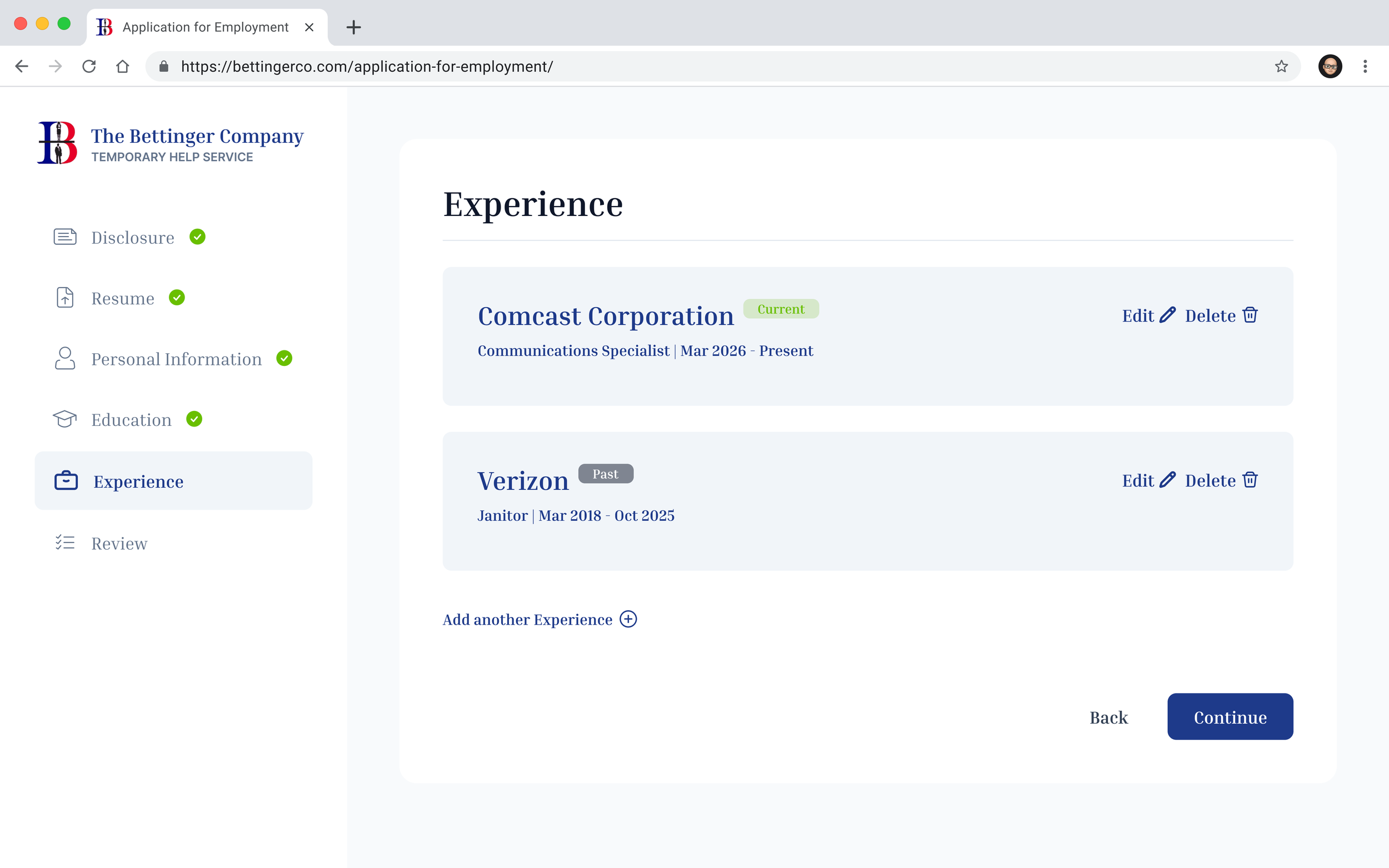
Experiences List
Review
-
![]()
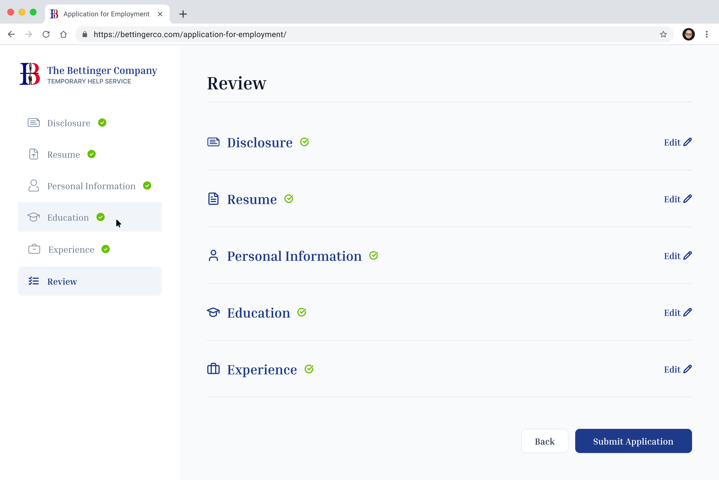
Review - Collapsed
-
![]()
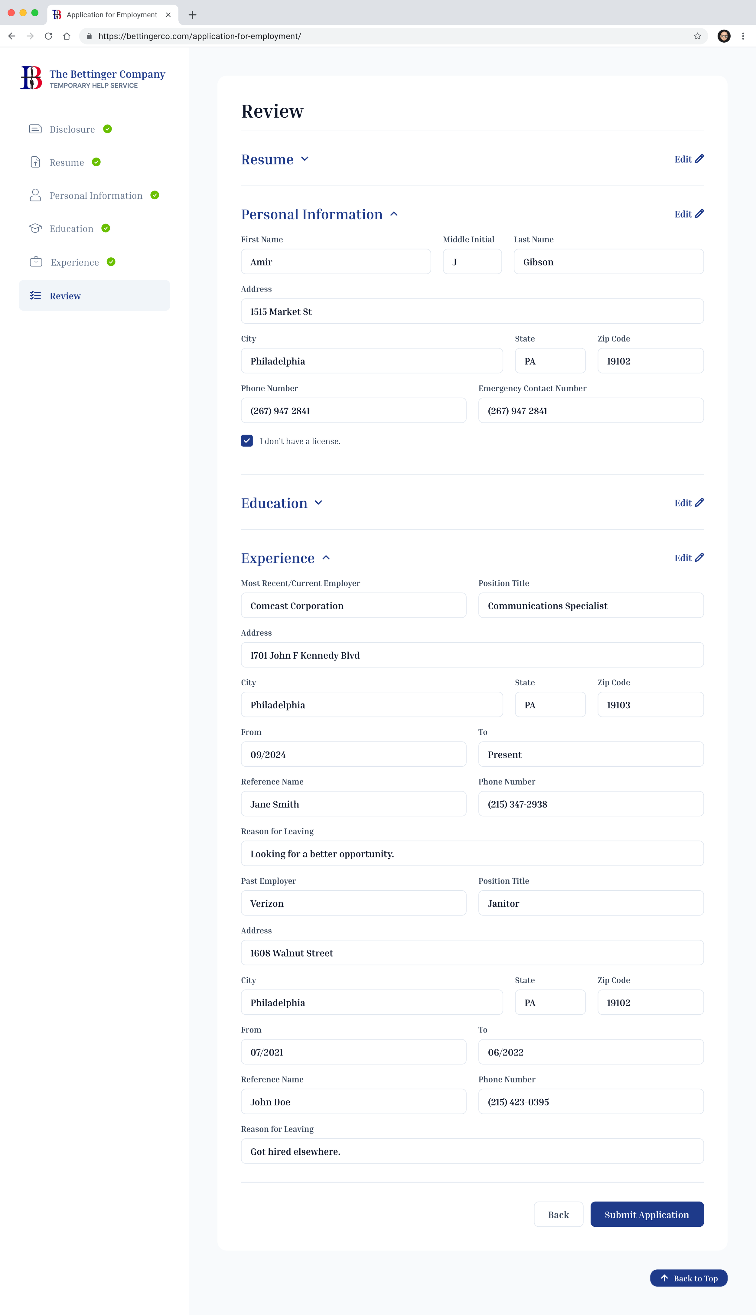
Review - Partially Expanded
-
![]()
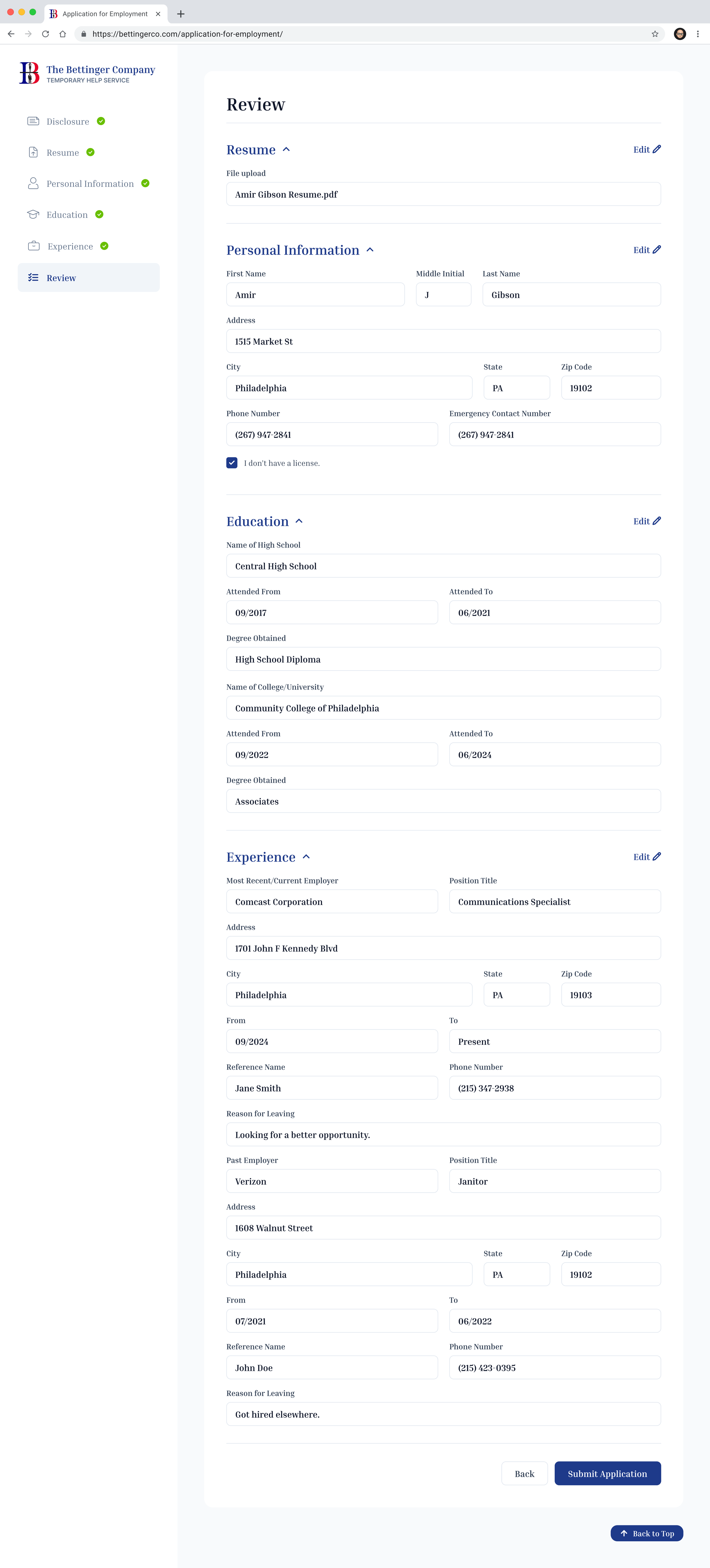
Review - Fully Expanded
Overview
The Bettinger Company's online job application is the first thing every candidate interacts with before they ever talk to a recruiter. I identified usability issues in the existing flow, proposed a redesign, and led the design effort end to end — using Figma Make to move quickly from wireframes to polished, testable screens.
The Problem
I audited the existing five-step application flow — Disclosure, Resume, Personal Information, Experience, Review — and found three issues that made the process harder than it needed to be for candidates:
1. No real navigation. The sidebar showed a checkmark next to each completed step, but the checkmarks weren't clickable. The only way to revisit a step was the "Back" button or the Edit links buried in the Review screen. A candidate who wanted to fix one field had no direct way to get there.
2. Personal Information was overloaded. One screen combined contact details, license information, and a candidate's entire education history — high school and college, each with their own set of fields. It was the single densest screen in the flow, with no clear reason those two very different kinds of information needed to share a page.
3. Experience had no shape. Employment history was a flat, ever-growing form. Each employer added a full block of fields — name, address, dates, reference, reason for leaving — stacked directly below the last. A candidate with several past jobs would be scrolling through a page that just kept getting longer, with no way to see their history at a glance.
Design Process
Mapping the existing flow
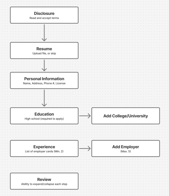
Before proposing any changes, I diagrammed the current step-by-step flow to see the whole picture at once. That made the core issue clear: the flow's structure was fine — five linear steps toward submission — but the content inside those steps, and the lack of any way to move between them non-linearly, was where the friction lived.
Redesigning against each issue
Each fix was scoped to solve one specific problem rather than a general "make it better" pass:
Clickable sidebar navigation. Once a step is marked complete, the sidebar item itself becomes a link — not just a status indicator. A candidate can jump straight to any completed step instead of walking backward through the flow one screen at a time.
Splitting Education out of Personal Information. Education became its own step, with its own icon in the sidebar. Personal Information is now just contact details and license info — a screen that's actually about one thing. The "Add college" progressive-disclosure pattern (only show college fields once someone says they attended one) carried over unchanged, since it was already working well.
Redesigning Experience as a card list. Instead of an ever-growing form, completed employer entries now collapse into compact cards — employer name, position, dates, and a Current/Past status badge, with Edit and Delete actions. Adding a new employer reveals a focused entry form inline rather than permanently expanding the page. This keeps a candidate's full employment history scannable at a glance, no matter how many jobs they've held.
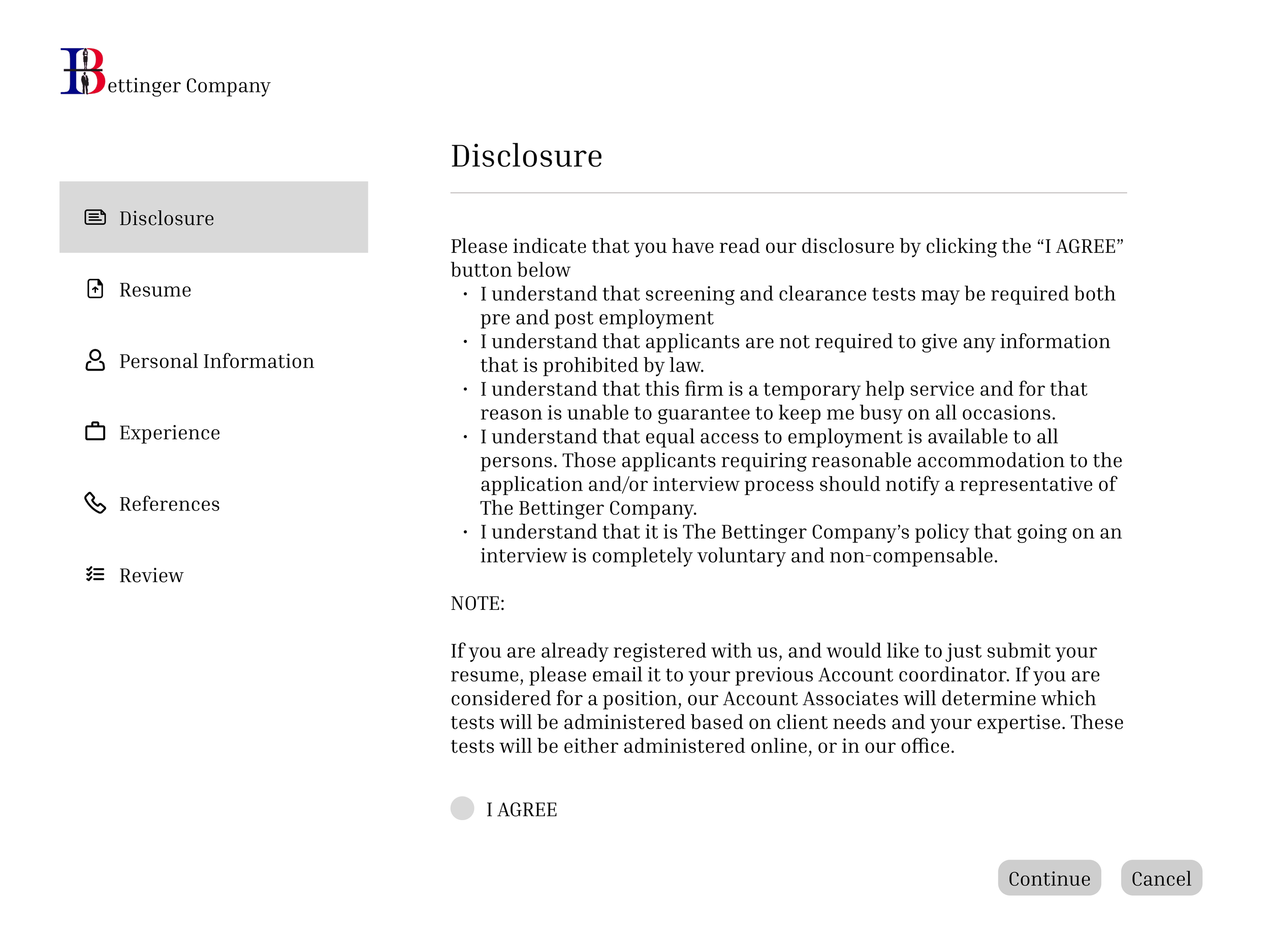
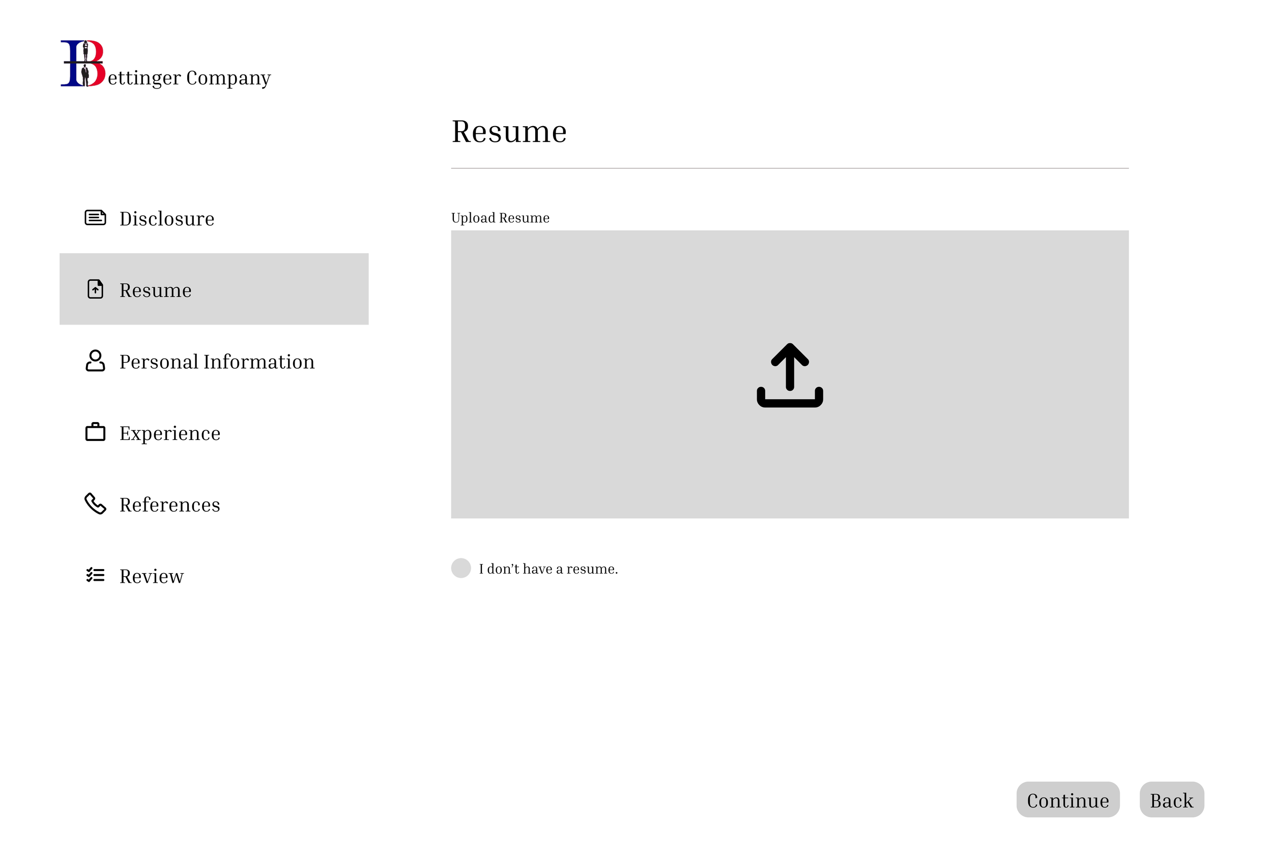
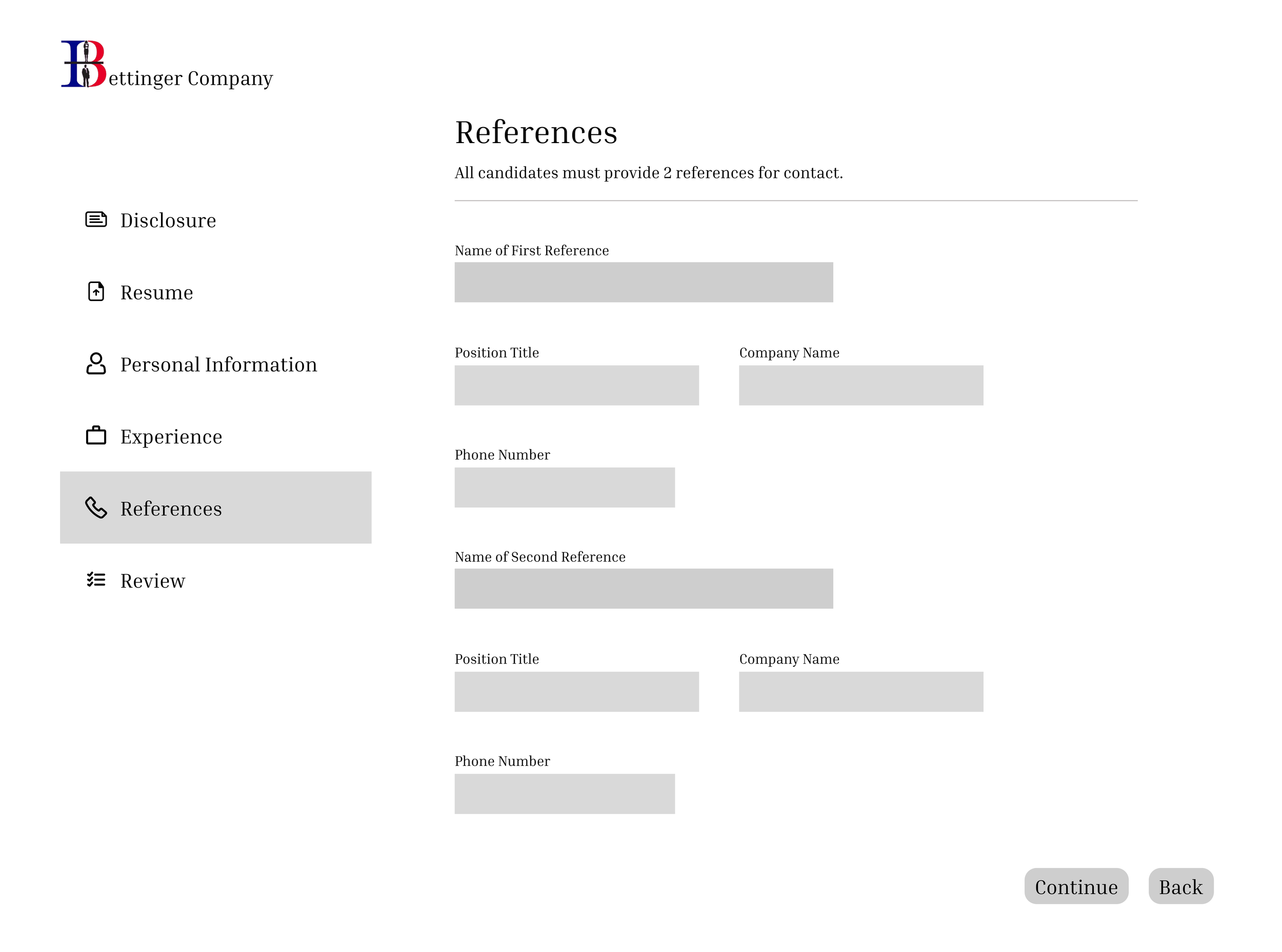
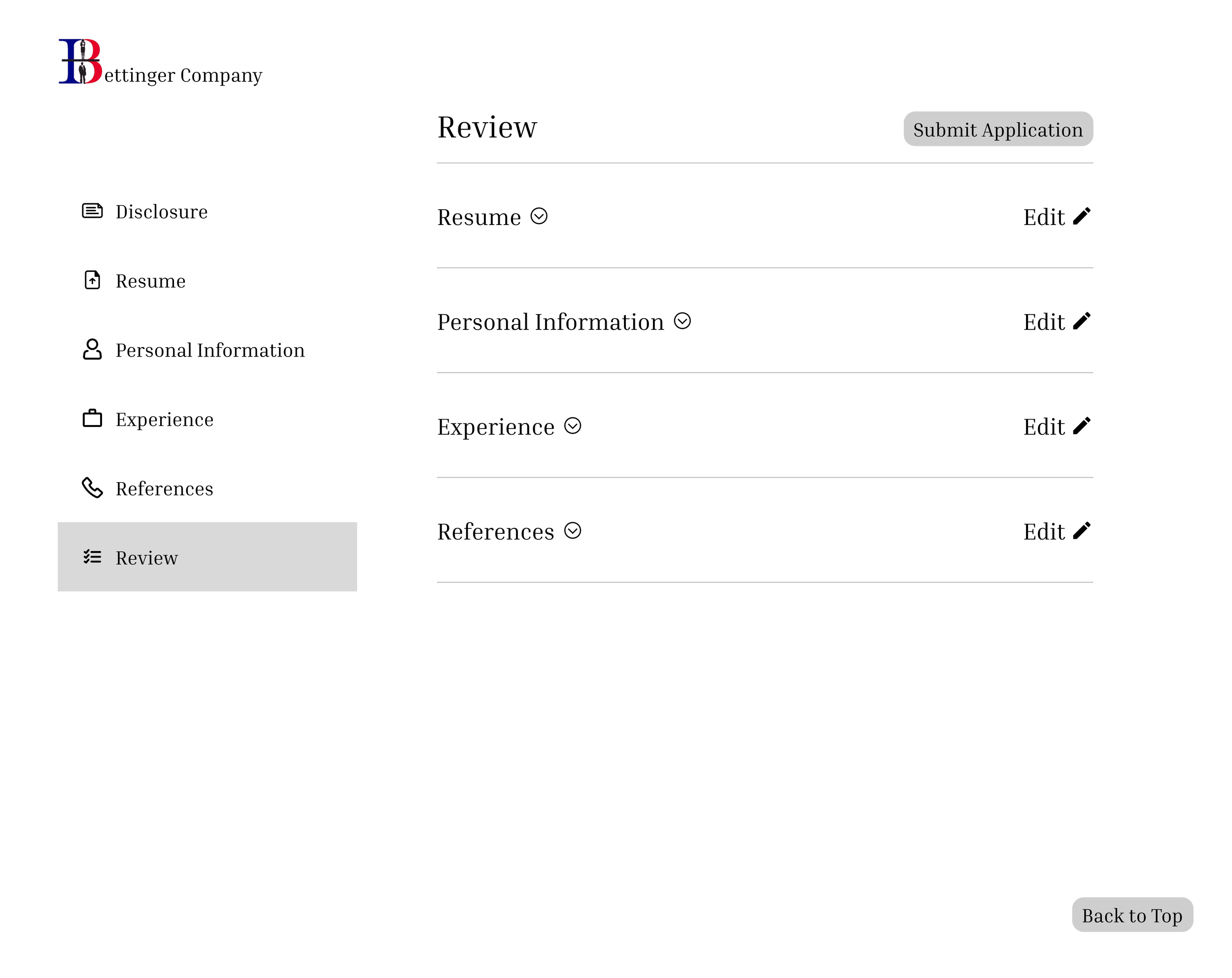
Lo-Fi Wireframes
-
![]()
Disclosure
-
![]()
Resume
-
![]()
Experience
-
![]()
References
-
![]()
Review

Components
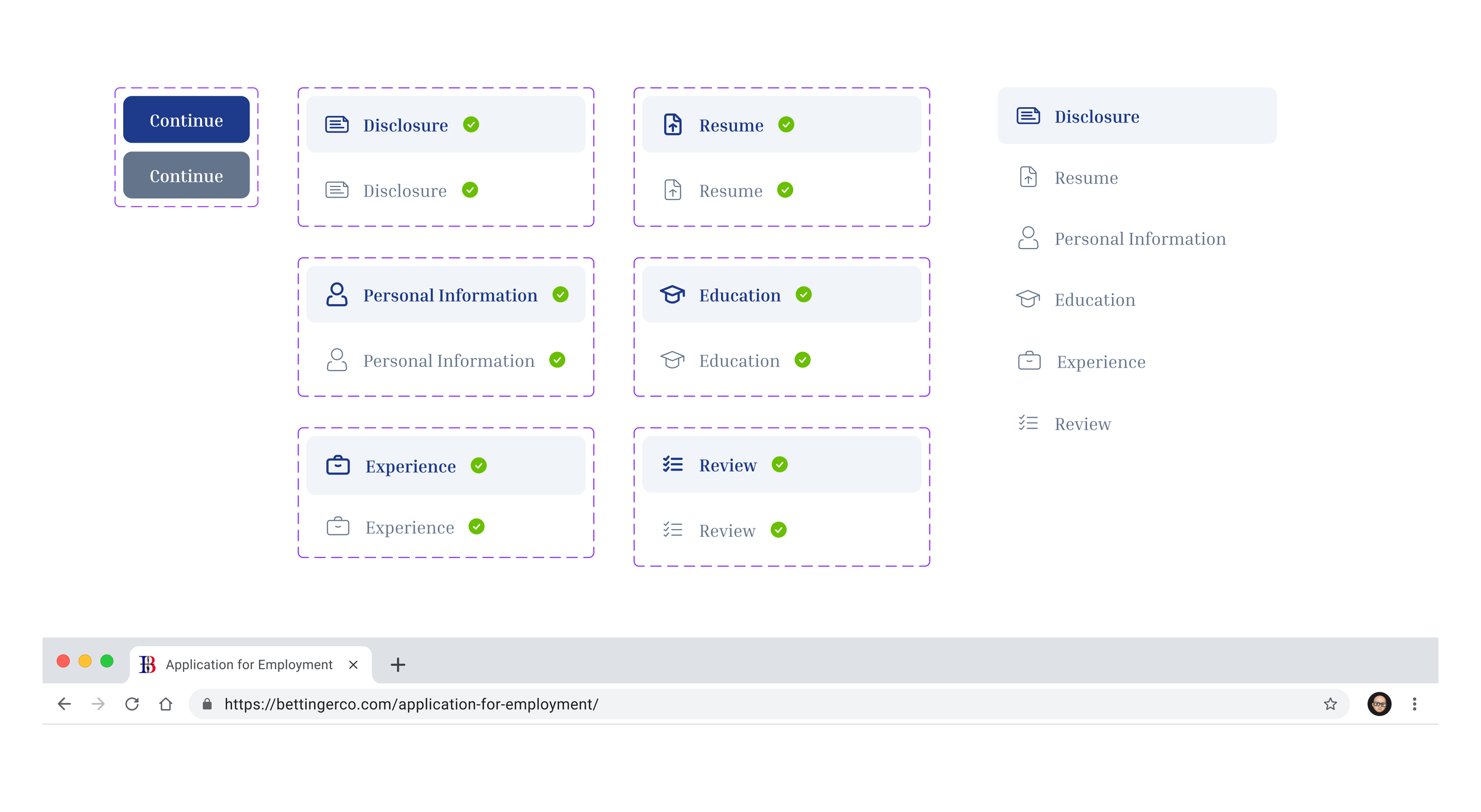
Making the sidebar navigation fix actually functional — not just a visual idea — meant defining explicit states for every nav item and button, not just a single static look. Each sidebar item has a distinct default and active state, and Continue buttons have a clear enabled/disabled distinction so a candidate always knows whether they can move forward. Consistent states across all seven steps is what makes the jump-to-any-step navigation feel reliable rather than accidental.
Outcome
The final flow resolves all three original issues: every completed step is directly navigable from the sidebar, Education stands on its own instead of sharing a screen with contact details, and Experience is a scannable list of cards instead of an ever-growing form. The Review screen also picked up its own collapse/expand pattern per section, so a long application doesn't turn Review into a wall of text either.
Figma Make was useful throughout for turning wireframes into polished screens quickly — letting me spend more time on interaction details, like exactly how a collapsed experience card should read, rather than on manually rebuilding every screen from scratch.
Final designs are shown above on desktop.